The 2018 Global Talent Search

These opinions are my own and are in no way representative of Lilla Rogers, Lilla Rogers Studio, or Make Art That Sells.

If you’re reading this, you probably know that I was one of the winners of the Lilla Rogers Studio 2018 Global Talent Search. My life has been an absolute whirlwind since then, but I thought I’d share my thoughts on the competition—what it was like to compete, and what it takes to win—while it’s still reasonably fresh in my mind.

If you haven’t participated in it before, it goes like this: Once you’ve registered, you’ll get access to the first assignment. If you make it through to the next round, you’ll get a second assignment, and if you make it through that, you’ll get the final assignment. Only Lilla knows what the assignments will be ahead of time, but rest assured they’ll be geared towards markets she wants to focus on. If you’re lucky, they’ll all be in your wheelhouse. If not, you can still challenge yourself. You might make it to the next round, but at the very least, you’ll learn something.

I’ll level with you. I didn’t enter the competition to win. In fact, I thought I had zero chance of winning. I did it for two reasons: one, I’d already paid for it with my classes, and two, my friend Rachael Schafer made it into the top 50 a few years before and got a couple of jobs because of it. I was in it to get my work in front of the judges. That’s it.

Was I selling myself short? I don’t think so. With over 1000 contestants, competition was super fierce, and all of the previous winners (and assignments) were very strong in surface design and home decor…not exactly my forte. But it’s always worth a try, right?

Assignment 1

Our first assignment was to do a gardening journal. I live in a tiny apartment with no yard. I didn’t even know that was a thing! We had to include anemones and staghorn fern, as well as some sort of text.

Here’s my submission:

GTS-FINAL-lr.jpg

My approach to this was to (try to) be a little clever. The truth is, with so many incredibly talented contestants, I knew there were going to be hundreds of seriously beautiful entries. I didn’t think I could compete with that. Not enough to stand out. So I did what I could do. I included a moderately humorous, but still accessible pun, and I added some foil to the lettering…because who doesn’t love a little foil on a book cover?

Why this round is hard:

You're competing against 1000+ people. You’ll likely be more experienced than a significant portion of them, but there will be a bunch who are more experienced than you. And it’s not about doing one good piece. If Lilla likes what you did for the assignment, she’s going to then look at your body of work. So you have to have several strong pieces, and be able to demonstrate that you can create marketable work regularly.

How to get an edge:

Start competing now, and I don’t just mean get your portfolio ready (but do that, too). This isn’t your typical art contest. It’s not just about art. I suspect a lot of people misunderstand that. It’s about building a career…a professional relationship that may last a lifetime. So naturally a big part of the competition is personality. You could be the best illustrator in the world, but if you don’t conduct yourself professionally, Lilla’s not going to give you the time of day. When she selects her top 50, she’s not just picking art she loves, she’s picking people she could see working with. At this point, she has no idea who will win GTS. She doesn’t even judge in round 2, so it’s important that she selects a pool of people, any one of whom she’d be happy to represent.

The best way to get in that pool is to get in front of Lilla. That’s certainly going to be easier if you take her live classes, but do you have to? I don’t think so. She’s accessible via social media. She’s on instagram a lot and goes Live on Facebook regularly. And she’s always paying attention. If you’re engaged and kind, and you contribute, that’s going to stand for a lot. If you mention her, if you comment on her posts, chances are she’ll start to recognize your name. And if you engage with the community, and build visible relationships with people she admires, even better. I feel comfortable saying that she’s not going to pass over a great artist that she’d love to rep, for an artist she’s less excited about but who took her classes. That said, there’s definitely something positive to take away when a person is serious enough about their career to invest in it.

Another thing you can do to give yourself an edge is get feedback from working illustrators. I can’t stress how important that is. You need people you can trust to share constructive feedback, even if you’re competing together. If you’re too competitive to give feedback, or if you’re too protective of you work to get feedback, then you’re probably doing yourself a disservice. You don’t have to do this on your own. It’s not cheating. When you work with a client you’ll be expected to work with feedback. It’s an important part of the process, and it makes you a better illustrator. And if you’re like me, it will pull you out of analysis paralysis from time to time. This is where I give Cassandra Fountaine a big shout out for being awesome at critique…and art in general.

Making it into the top 50 was a big relief. I’d done what I set out to do. It wasn’t until I saw the next assignment that I thought I could go further.

Assignment 2

The second assignment was a graphic novel page. Now THIS was in my wheelhouse. I love comics and graphic novels. There was a short point in my teens when I collected comics, and I took Comic Book Illustration in college. I even spent a year on a webcomic. The point is, I could do this in my sleep, and more importantly, most of the competition couldn’t. That is to say, I figured it was probably foreign territory for most.

Here’s my submission:

aSailorsTale-blue.jpg

We had to use a collection of specific objects in this comic, and of course, text. The text could be anything, and it didn’t have to be an actual story, but I like storytelling, both verbal and visual, so I went all out and made a complete story with rhyme and a bit of a twist. It was fun, but I still lost sleep over it. Because at this point, even though I was no longer competing against 1000+ people, I was competing against 49 very strong artists, and that’s just as tough.

Why this round is hard:

This round is hard because there are multiple judges, and chances are, they don’t know you. They’re just looking for what they feel is successful art based on a set of criteria that Lilla gives them (and you). They may not even agree, so you have to generally appeal to everyone.

How to get an edge:

Your best bet is to be fairly well rounded, so hone your drawing skills and explore different markets. Chances are the judges will be from a variety of markets (like magazines, book publishers, product manufacturers and other art licensers/buyers), and they’ll be looking for different things like, composition, color palette, typography, storytelling, etc. The better you are at these things, the better you’ll do. And again, use a critique group. They’ll help you spot problems you may miss.

Beyond just generally being a very good illustrator, there’s one other way to get through round 2, and that’s with votes. Unfortunately your friends and family won’t cut it, so you’ll need to have a big network. The bigger the network, the more votes you can (probably) count on, so if you’re not working on building your following, get to it. It is a bit of a popularity contest, but it’s also worth noting that the person with the most instagram followers didn’t win the People’s Choice Award last year.

Even though I felt pretty good about my chances this round, I still lost sleep waiting for the results. Again it was a relief making it through, but the final round was the most intense of all.

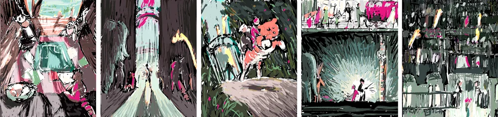
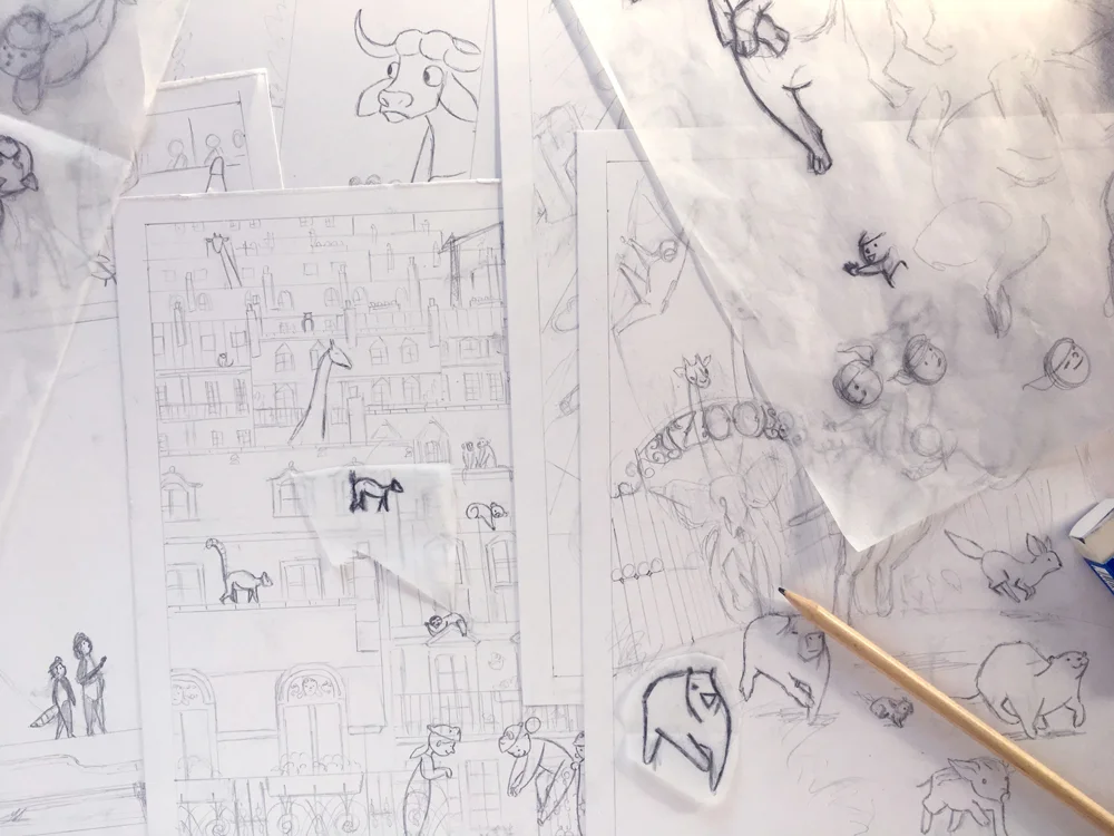
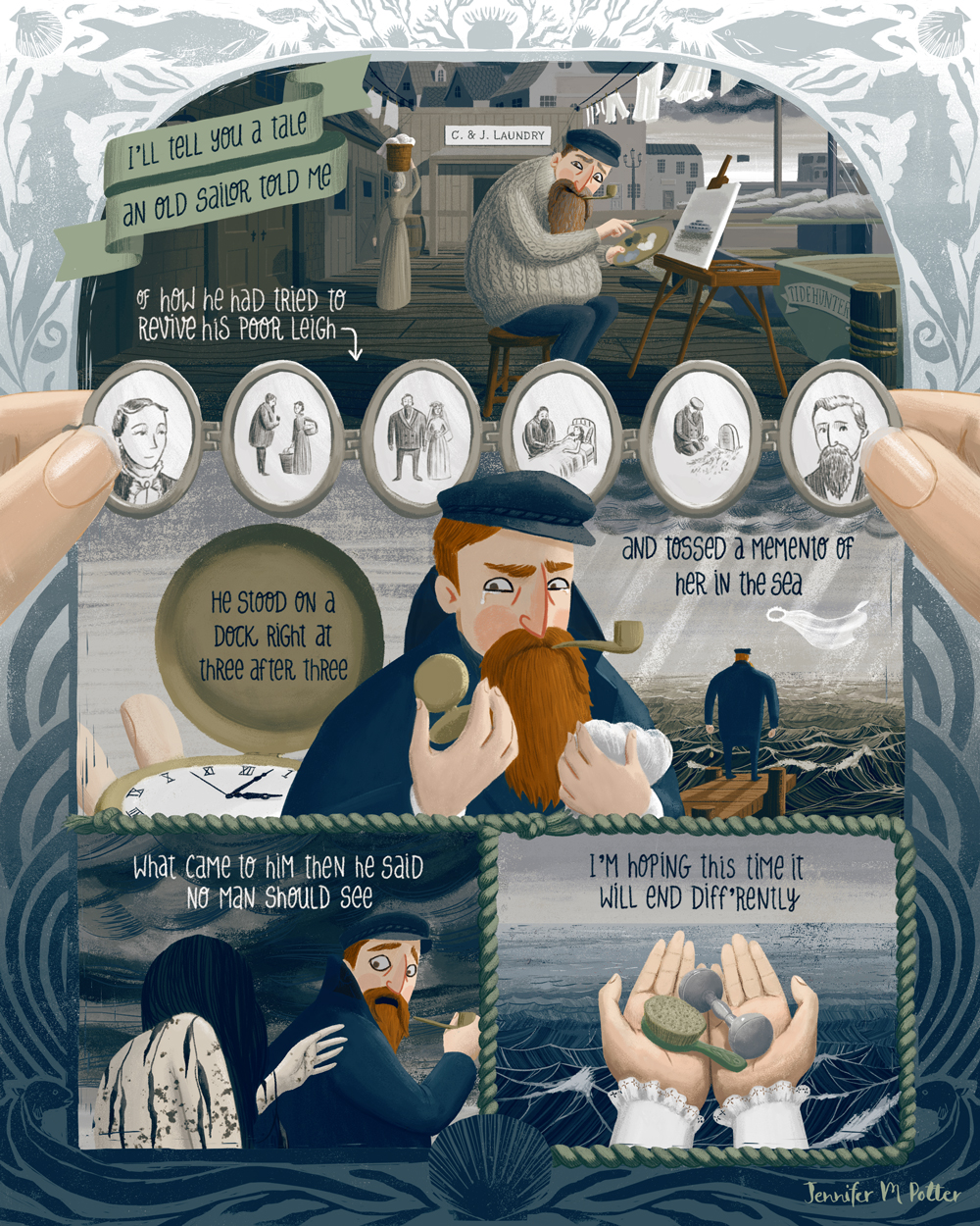
The 2018 Global Talent Search, Round 3

In the final round we had to illustrate a spread from a children’s book. If you’ve ever taken the MATS Illustrating Children’s Books course, then you’d recognize the format. We were given three short passages and told to pick one and illustrate a spread and an (optional) character sheet.

Here are mine:

JENNIFER-POTTER-scene-lr.jpg
JENNIFER-POTTER-characterSheet-lr.jpg

By this point of the competition, I was super anxious. I was competing with successful, experienced artists, each one completely capable of winning. What’s more, I was competing against friends., people that I’d been in class with and really respected. I wanted all of us to win. I knew Lilla had picked more than one winner in the past, and sincerely hoped she’d take us all.

I can’t tell you how glad I am that she did.

Why this round is hard:

At this point, it’s anybody’s game, and I think more than anything, what’s hard is realizing what you have to lose. I started to believe that winning representation was possible, and realizing how much more work I had ahead of me if I didn’t win, was super stressful.

How to get an edge:

You get to communicate with Lilla and her team directly at this point. It’s a chance to demonstrate that you’re professional and easy to work with, so be charming! You also get to work with Lilla as you would an art director, so ask for feedback, and take what she tells you to heart.

That’s about it. I definitely got a few more gray hairs out of it and maybe shaved a couple of weeks off my lifespan. It was wild. I worked non-stop. I also got VERY lucky. My passion is for storytelling, and all of the assignments were book-based. It could not have gone better. If it was any other year…if there were any other assignments…I might have not have made it past the first round.

In retrospect it’s pretty funny. People sometimes ask me how to get an agent, but of course I got mine the most absurd way possible. So I guess my advice is to just drive yourself bonkers for a few months and then everything should fall into place. ( ❛ᴗ❛)

Jennifer M PotterComment
Bologna Children's Book Fair - What to bring

It's been just about a month since I attended the Bologna Children's Book Fair, and my head is still spinning from all the inspiration. It was my first trip to the fair, and I already want to go back!

ACS_0056.JPG
ACS_0064.JPG
ACS_0062.JPG

It was a bit of an accident that I went at all. I learned about the fair during my MATS Illustrating Children's Book class. Thanks to a good deal at Norwegian airlines, I was already planning to be in Italy at the beginning of the month, so after a bit of deliberating, I decided to change my ticket home in order to stay for the fair.

I spent the next couple of months hustling to get ready. There are a lot of blog posts dedicated to surviving the book fair, many with recommendations on what kind of materials to bring, but it's hard to find out how much to bring. Most of the posts I found just say bring as much as you can carry, which isn't entirely helpful. Especially when you're going to be hauling that stuff around for a month like I did!

IMG_3956.JPG

Here's what I brought:

Portfolio x 1
I looked into have a book professionally printed before the show, but there wasn't enough time, so I went with a nice 8.5" x 11" screwpost binder and printed everything at home. In retrospect I'm glad I did. Now I can easily update my portfolio rather than having to have the entire thing reprinted. And no one seemed to be put off by the portfolio in any way. It was a good size. I would steer clear of anything bigger. You don't always have a lot of space to put your portfolio down when you're showing it. I also wouldn't go too much smaller. It should be substantial enough to show detail.

Posters x 10 (used 4)
The posters are for the Illustrators Wall. I printed them at home on nice paper. I read a post from someone who'd brought four and said that hadn't been enough, because they kept getting removed or covered. Here's what I discovered: People are generally respectful and try not to cover up or remove your stuff, but if you have a nice looking poster with no tear strips or business cards, people might just take your poster. That's not necessarily a bad thing if it's a publisher loves your work and can't take a photo because of a dead phone battery. But it's probably better to have cards or tear strips. I made little paper card holders and attached them to my posters and restocked the cards periodically. I only put up two posters because I didn't want to take too much space from other illustrators. I gave the other posters away to publishers. I'd say the letter size was good. It was easier to pack than 11x17 or A3 would have been, but it was still noticeable enough.

Business Cards x 200 (used ~100)
I printed mine through Moo, so I was able to get several different backgrounds. This worked out well because when a publisher liked a specific image in my portfolio, I was able to give them a card (or a few) with the same image. Having a variety also helped me get a better sense for which of my work people responded to the most. That said I probably only gave out a couple dozen business cards. The rest were left with my posters at the Illustrators Wall. 

Postcards x 250 (used ~100)
I also printed these at Moo, but I didn't do a variety. Instead I chose my two best pieces and printed one on each side. Most of these were given to publishers. I gave them away at meetings and portfolio reviews, but I also left them with publishers who weren't seeing Illustrators. Postcards are perfect for this kind of thing, much more so than business cards, because eventually an Art Director will go through them, and if they like your art, they may just hang your postcard on the wall and keep you in mind when the right project comes up. For this reason I went with 5"x7" although I noticed most people went with 4"x6" (or A6). It's also fun to trade postcards with other illustrators, so you have a nice stack of souvenir art to take home!

Stickers x 200 (used ~20)
These were fun but completely unnecessary. I gave them to a few publishers, but mostly I just traded them with friends. I knew I wanted stickers anyway, so it wasn't a waste. I'd bring them again, but I'd cut down the amount just to save the packing space.

In the end I brought way more than I needed, or to put it differently, I wasn't as good about giving things out as I should have been. Printing gets expensive, and it's easy to be frugal with your stuff in an attempt to ensure your hard-earned dollars go to people who can help create opportunities for you, like agents and publishers, rather than fellow illustrators. In hindsight, that was the wrong approach. I saved my postcards thinking I'd send them to publishers after I got home, but I learned so much at the fair and got so much useful criticism, that the postcards already feel obsolete. I'm kicking myself for not leaving everything at the Illustrators Wall on the last day.

IMG_6800.JPG
IMG_6806.jpg
IMG_6779.jpg

I know people who've questioned if leaving stuff at the Illustrators Wall is worth it at all, since a lot of people who take your cards are other illustrators, but I did get contacted by a publisher who found me on the wall, so I think it's worth it.

If I'm lucky enough to go back, I'll bring:

1 Portfolio
4-6 Posters
100 Business Cards (with fewer backgrounds)
200 Postcards (possibly a mix of nicely printed 5x7s and some less expensive ones to leave at the Illustrator Wall)
100 Stickers
20-50 Concertina Portfolio Books (I want something to give to favorite publishers that will show my range of work, something that will look good hung up on the wall, and stand apart from the usual postcards)

And of course, no What to Bring to Bologna list would be complete without:

  • Blu-tack to hang your posters

  • Glue or tape - to attach your card holder to your posters if you go that route

  • Lunch - the lunch lines are long and you might be too busy with portfolio reviews

  • Water - hydration is key

  • Comfortable shoes - seriously, you will be on your feet all day for days

  • Layers - Bologna gets cold in March, but it can be warm in the convention center

  • A backpack - a one-shoulder tote gets old

  • A backup phone charger - you don't want to miss out on things because your phone is dead

  • A safe space for your wallet and phone - a friend got pick pocketed on the bus coming back from the fair. This is not uncommon in Italy. Be aware, and be safe!

  • Friends!

Okay that last one might not be the easiest, but it's important. It's always nice to have someone to eat lunch or dinner with, or to chat with while standing in line, but it's also helpful to have someone (or a group) who will share information about portfolio reviews and meeting opportunities. Look for illustrators who are going to Bologna and say hi to them before the fair on Instagram or Facebook. Start a group on Whatsapp, Facebook or Instagram, and make a plan to meetup for lunch on the first day. If that's not your thing, chat with people in line. See who's traveling on their own, and invite them to meet up later. A lot of illustrators go to the fair on their own, and it can be really overwhelming. A friendly face can go a long way! I was terribly nervous going to the fair, but I was fortunate to have connections with several illustrators from class and Instagram. My experience was twice as rewarding because of them!

IMG_6864.jpg
IMG_6728.jpg
IMG_6842.jpg
Happy Holidays!
holiday-card_ss.jpg

Have you ever seen those videos where dogs slide down snowy hills just to run back up and do it all over it again? There are a few! There's even one with a little bulldog running up a grassy hill just to roll down again and again. They make me so happy to watch, and I wanted share a little bit of that happiness this season. I'm sure a lot of people won't get the reference, but hopefully it works on its own.

Even though it's a simpler design, I did this card in the same way that I did my Zoo Heist pieces. First I sketched it digitally, then I printed it out and used tracing paper to transfer the image to paper.

IMG_3169-lr.jpg

Then I painted it, and finally I scanned it and edited it digitally.

IMG_3175-lr.jpg

Now here's a dog sliding downhill!

Jennifer M PotterComment
Zoo Heist!
zooHeistRow.jpg

Due to a complete coincidence, I'm going to be in Italy right around the time of the annual Bologna Children's Book Fair, so I decided to attend. In addition to the book fair, the coordinators also release an Illustration Annual, a book filled with gorgeous illustrations from established and up and coming illustrators. It's very hard to get in (they get thousands of submissions), but if you submit, you get discounted entry to the book fair! And of course there's the added benefit of having a few more portfolio pieces, so I decided I ought to give it a go.

The brief was simple: five pieces, no more no less, all with a common theme. I ordered a few of the recent years' annuals for research purposes and went to work. The scope of work in the annuals is very broad, and I would say it has a bit of an editorial feel. At least on the whole, it seemed more mature than typical picture book art. But my pieces had to act as portfolio pieces, too, so I needed them to show prospective agents and publishers what I could do. Before I chose my theme, I made a list of everything I wanted to demonstrate with these pieces. The list is a mixture of things publishers want to see and things I'm particularly adept at. Gotta put your best foot forward!

IMG_3181.jpg

Once I had my list, I started thinking of scenes that would demonstrate these elements. I put pencil to paper and drew over 30 thumbnails. As I worked, a story started to emerge. I narrowed down the thumbnails to the five that best checked all the boxes, and Zoo Heist was born! 

I knew I wanted to work in gouache, but I also wanted the freedom of arranging pieces digitally, so I developed my sketches in Photoshop before committing them to paper. I sketched in black and white, reworking some of the compositions until I had five pieces I was happy with.

thumbnails.jpg

Then I added color. I worked on all five thumbnails at the same time, making sure I had a cohesive palette. 

color-thumbnails.jpg

Once I had my colors figured out, I started drawing on Bristol. I drew all five pages freehand, based on the thumbnails I developed. Drawing on paper is a little nerve wracking for me. I'm very accustomed to working digitally. I like to try things out and reposition stuff. So I decided to incorporate tracing paper into my process. It was the best decision! It gave me a lot of freedom to test things out and see how they'd look before committing.

IMG_2952-lr.jpg

Once the pencils were done, I started laying in some washes. The purpose of this base layer was to lay the foundation for the lights and darks, and to provide an undercoat of color to make the colors richer and more textured. I used Acryla Gouache for the first time, which was a little bold, but I knew I had to work fast, and I wanted to be able to layer colors without reactivating them. Unlike real gouache, Acryla Gouache uses and acrylic binder, so it's waterproof once it dries.

IMG_2989-lr.jpg

I then went to work painting the pages. I only had a few days to finish everything, so I painted quickly and loosely, knowing that I would be able to tighten everything up digitally.

IMG_3011-lr.jpg
IMG_3014-lr.jpg

Once the paintings were done, I scanned everything in and did an overpainting in Photoshop. I adjusted the lighting and enhanced the compositions as necessary, but mostly I tried to stay true to the original paintings.

I worked down to the wire. I put on the finishing touches on the morning it everything was due! Fortunately I invested in a good printer, and printing everything without a hitch. Then I just had to put my packet together and rush off to the post office!

IMG_3047-lr.jpg

There you have it! Here are the finished pieces:

1-1000.jpg
2-1000.jpg
3-1000.jpg
4-1000.jpg
5-1000.jpg
MATS Illustrating Children's Books course

Hi all. I've had a few people ask me about my experience with the Make Art that Sells Illustrating Children's Books course, so I figured I'd write about it. I'll warn you, this is a long post! First I'll talk a little about my week to week experience, and then I'll share my thoughts on the class as a whole.

Prep Week

I decided to take the Illustrating Children's Books course on a whim. Well, to be more precise, I did the free pre-class prompts on a whim, and got so much out of the experience, that I decided to enroll in class. (The prompts are all available on the Make Art that Sells blog here.)

MATS Illustrating Children's Books Prep assignments

The prep week includes five days of prompts, and I experimented with each one. I was struggling with my art when I started, so I explored different styles. I only intended to do the prep week, but by the end I'd arrived at a place I was really happy with, so I decided to continue.

The course is laid out in five weeks, with each week devoted to exploring a different skill necessary to break into the picture book industry. There is one main assignment each week and six small sketchbook assignments. There is a ton of information sprinkled throughout the course on topics such as building your portfolio, pitching to publishers and agents, and the industry itself. At the end of each week, students submit their main assignments, and a few days later, the instructors, Lilla Rogers and Zoë Tucker, publish a video providing feedback on some of the students' work.

Week 1

Week 1 Assignment: Character

Week 1 Assignment: Character

Week 1 is all about picking one of three stories and designing your main character. Each story is written by Zoë Tucker, a creative director in children's book publishing. For this class, we were given texts that feature a little girl, a turtle, and an egg and spoon. I used a provided worksheet to examine the texts and ended up choosing the turtle text.

The first week was both exciting and frustrating. I went in knowing I had a lot to learn, but also feeling pretty good about my skill level. But after seeing my classmates' work, I knew I had to step up my game. The level of talent in this class was amazing, especially given that it's open to anyone. Sure, there were people at all different skill levels and points along their career paths, but on the whole, it was well above average. That was the exciting part.

The frustrating part came when I realized that all of the content was designed in a previous course and with different texts in mind. A big part of Week 1 is about giving your character personality through accessories, but the text I chose featured a newborn baby turtle...not typically known for their ability to accessorize. Now, I could have claimed artistic license and put my character in footy pajamas (which would have been adorable, now that I think of it), but I was also under the impression that my text was supposed to have a nonfiction slant...another misunderstanding which arose due to dated content.

The frustration was amplified at the end of the week when our assignments were reviewed. I understood the format well enough that I didn't expect to be personally reviewed, but in fact very few turtle assignments were. So, not only was I feeling unsure if I was on the right track and wishing I'd chosen a different text, I was also left with very little guidance to bring into the second week.

Week 2

Week 2 Assignment: Emotions

Week 2 Assignment: Emotions

The lack of accessories aside, I felt pretty good about my turtle in Week 1. I'd done a lot of sketching from photos, and I felt I had something with personality that was also anatomically accurate. But after watching the review, I decided to pull what I could from the feedback and apply it to my turtle. Most of the feedback was about the little girl text, specifically how to make her look younger, but I wanted to do what I could to make my turtle as compelling as possible, so I pushed the proportions a bit.

I think the emotions came out okay for a creature with no eyebrows and a very inhuman jaw, but they might be a bit cartoony. I tried something different with the style, but I still felt like I was struggling.

Fortunately there were more turtles in the review this week. I was still a little frustrated by the importance the instructors put on accessorization, but some of the class handouts showed great examples of animals with no accessories, so I decided to stick to my guns and trust that my character had enough personality on its own.

Week 3

Week 3 Assignment: Poses—Turtle (digital)

Week 3 Assignment: Poses—Turtle (digital)

Week 3 Assignment: Poses—Tiger (gouache)

Week 3 Assignment: Poses—Tiger (gouache)

Week 3 was all about poses. This was the only week that we were allowed to turn in two assignments, one for our main character, and one for our secondary character(s). I sketched a lot of tigers that week! It turns out that I really enjoy drawing tigers (way more than turtles, apparently). I ended up liking one of my tiger sketchbook pages so much that I decided to use it as my assignment.

Then I tried to paint a turtle page to go with it, but instead of doing it in gouache like I should have, I did it digitally. The truth is, I've been working digitally much longer than I've been painting, and not having a CTRL-Z scares me. So if something's important, I prefer digital, but I'm trying to push away from that. I've learned (in large part due to the work I did in this class) that working without a safety net allows me to produce better work. Strange how that works.

I was not happy with my assignment this week, and I even considered not submitting it. But I did, and I was one of the people selected for review. The criticism was on the gray background...Zoë said a lighter background would be better, and I agree. 

Week 4

Week 4 Assignment: Environment

Week 4 Assignment: Environment

This was the week I'd been looking forward to the most. I think I'm strongest at environments, and I really wanted to show it, so I put everything I had into this piece. I painted all of the characters in gouache, but I created the environments digitally. In hindsight, I wish I'd painted everything, and I considered it, but I was still too afraid to get completely out of my comfort zone. When it was all said and done, I spent over 50 hours on this spread, but I think if I'd painted it, it may have taken less time and garnered better results.

I did not make the review this week, and although I knew it was a longshot, part of me thought that if I tried really hard, I could make it. I was really bummed at first, but I got over it. Resilience is key.

Week 5

Week 5 Assignment: Cover

Week 5 Assignment: Cover

This was the final week of class, and it was a breeze compared to the week before. I still worked hard (I created over 20 thumbnails for this assignment and developed two finished pieces). But a lot of the decisions about characters, style, and color were already made earlier in the course, which left me free to focus on composition. I know that's something that Lilla focuses on a lot in the class...creating assignments that build off one another, so that the big assignments feel more manageable. It really does help. As she says, "yard by yard it's hard, inch by inch it's a sinch."

I made it into the review again, and this time for good design. It was a really nice way to wrap up the class.

Course Review

I got a lot out of this course, but like anything, you get out what you put in. For me, it provided clarity. I went into it very unfocused. My work felt all over the place, and I didn't know what kind of work I wanted to do. But through the dozens of pieces I created over the six weeks of class (including the prep week), I learned a lot about my art, and how to highlight my specific skills. I know this because the work I've produced since completing this class has improved dramatically. It's not because of any one thing that was taught in class, it was just the sheer volume of work. I explored a lot, and it helped me see what was and wasn't working. I also came away with a clearer understanding of my next steps. I know what I need to put in my portfolio, and I know how to leverage it to get work.

But of course nothing beats a good pros and cons list, so here goes:

Pros:

  • There is a wealth of content. Between all the handouts and the class posts (which I've saved), I have over 80 PDFs of material, many of which I will continue to reference after the class.

  • The community is fantastic. Each course has it's own facebook group filled with inspiring and helpful artists, many of whom are professional. Some of my classmates were even artists I already admired and followed on Instagram! This community is invaluable when it comes to feedback, and (at least in my experience) the group is still active well after the class had ended. I love seeing new work from my classmates, and it's been wonderful to be able to get their opinions on new projects.

  • It is very motivating. The size of the class combined with the level of skill from my classmates, means there's a lot of competition for the limited review slots. Everyone is constantly bringing their A game, which means you have to, too. That means the class is hard and will kick your ass, but you'll also get a lot out of it. Lilla and Zoë also spend a lot of time showing you how to put together a great pitch, so you leave the course feeling like you know the kind of work you need to produce, and where to send it once you're done.

  • You'll (probably) get portfolio pieces out of it. I say probably because it depends on where you are on your journey. I had classmates that were so secure in their style that I have no doubt every piece they did made it into their respective portfolios. I've included a few of my assignments in my portfolio, but I was too unsure of my style going in to produce fully cohesive pieces for the entire course.

Cons:

  • Much of the course is prerecorded, and it's a little one-size-fits all.
    Sometimes (as I discovered) a specific text won't align perfectly with course material, but that's not to say you can't still learn from it. You could have a text about sentient hamburgers, and you'd still learn something if you put in the effort.

  • You (probably) won't get reviewed. I was very lucky. There were over 300 people in my class, and only roughly 10% made it into the reviews each week. Even if there weren't repeats (which there were), with only five reviews, that still leaves a lot of people out. Not making the review each week can feel like rejection. It is wise to make up your mind going into the class that you will try to get the most out of every week, even if your work is never reviewed.

  • You will not learn to draw. This isn't really a con per se, it's just that this is not an art class in the traditional sense. If you're looking for drawing lessons, you're probably better off looking elsewhere. This is more of a career guidance class. It takes the art that you do, at the skill level you're already at, and teaches you how to improve its marketability to agents and publishers. There are a few drawing demos, but they're short and pretty remedial. You are more likely to improve your drawing skills through the daily sketchbook assignments.

Final thoughts

Would I recommend this class? Absolutely. It's worth it for the materials, the community, the portfolio-building assignments, and the career guidance. All of that stuff is yours to keep well after the class is over, so even if you aren't very skilled at art yet, you have it for when you're ready to start your career. That said, if you're not already skilled at drawing, the work of your classmates could be intimidating. It's bit of an emotional roller coaster, and it's a lot of work, so make sure you're in a position to give it your all, and be ready to jump in with both feet.