Drawing Rocks (+tutorial)
rocks-title.jpg

You wanna know something? I still struggle with style. I’ve been illustrating professionally for over two years and I don’t feel like I’m anywhere close to figuring it out. Of course, I have pretty conflicted opinions about style in general, so it stands to reason. How are we supposed to do work that truly reflects our artistic core if we don’t have a clear vision of what that looks like?

Case in point: I was working on an illustration that was all set up for smooth sailing. I’d worked through my thumbnails in black and white and color, I had my lines tight, my perspective right, and I’d even made new Procreate brushes to get exactly the soft pencil look I was going for. But then I hit a wall. A rock wall.

The image in question features kids at the top of a steep ravine looking down, and for the life of me, I could not get the face of the cliff right. No matter what I did, it just felt off. It wasn’t bad. It just wasn’t what I wanted. I tried to tell myself it was okay…that people draw things in different ways and maybe this is just how I draw cliffs. But I wasn’t happy.

So I stepped back a bit. And I tried to draw a rock. And then I drew another one. And another.

rocks-rough.jpg

And you know what? I realized I can draw rocks fine! Just maybe not with my soft pencil brushes.

So I made some new brushes, and I painted some new rocks.

rocks-tight.jpg

I’m happy with the results. But it got me thinking.

Perhaps I’ve been struggling because I’ve been forcing myself to use the wrong tools—maybe I’m just not a soft pencil kind of gal. I’d gotten it in my head that that’s what I’m supposed to be. And not even for a good reason…because an art director said something about someone else’s art two years ago that made me rethink my own.

I’ve had cause to look back over my art since then and I can see how it has edged away from what truly speaks to me. I’ve been forcing myself to use tools that make it harder to do some of things I really love (like dramatic lighting!). Don’t get me wrong, I’ve learned a lot as a result. It’s all part of the journey. But I’ve lost some stuff, too. If drawing rocks has taught me anything, it’s that it’s important to step back from time to time and focus on the simple things.

So I’m gonna let go for a bit. I’m gonna stop worrying so much about the final look of a piece and start focusing on the process.

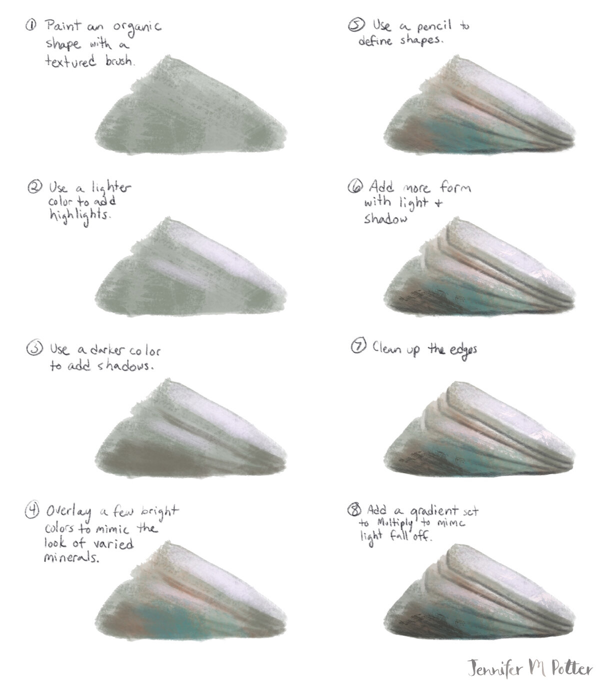
In the meantime, here’s a tutorial of how I draw rocks. I hope it shines some light on your own process!

rocks-tut.jpg
Jennifer M Potter
Sign your work!
jennifermpotter-sign-your-work-banner.jpg

A certain billionaire just raised the ire of the Twittersphere for his blatant refusal to credit an artist’s work. The offending tweets have since been deleted, so I can’t link them, but it was a flimsy attempt to justify laziness and only conveyed a lack of empathy for the work artists do. My own feelings aside, I thought it would be a good time to discuss your artist’s signature, or in far too many cases, the lack thereof.

First things first, as the title of this post suggests:

1) Sign your work

You simply can’t guarantee that a piece you post will always show up on your portfolio or instagram feed where it can be closely linked with your contact details. If you’re lucky, and your piece is popular, it’ll wind up on pinterest, tumblr, twitter, etc, and rest assured, you can’t trust anyone, certainly not billionaire philanthropists, to assign proper credit.

And the rationale that “any fool can find out who an artist was in seconds” doesn’t always work, even if you are a master of the reverse image search. Sometimes, things don’t turn up in the results. And that’s putting a lot of faith in the viewer to actually take the time. More often than not, they’re going to move on to the next thing in their feed. If they really like it, they may even share it…uncredited.

Which leads me to the next rule:

2) Use your full name

Whatever name you use needs to be searchable, so Chris S, J Hernandez, or VNH isn’t going to cut it. And if your full name is common, use your middle name or initial, like I do. If you prefer to use a pseudonym, that’s fine, but make sure it’s unique. With every piece you release into the wild, you should be prepared for an art director to come across it, see your signature, and easily search and find your portfolio and contact details. When I do an image search for Jennifer Potter, I get a sea of faces I don’t recognize. But when I search for Jennifer M Potter, I see my art. Try searching your own name to make sure your work is showing up.

3) Write legibly

Make sure your signature is legible. I mean really legible. Every character should be clear and impossible to confuse for another, especially if you’re one of those lucky people with an unusual name.

4) Keep it small

I see some of you with signatures that take up an eighth of your image. I applaud you for your commitment to branding, but it detracts from the art. The fact is, your signature doesn’t need to be that big. It should be just readable at 72 dpi. Keep it noticable, but unobtrusive. People know how to zoom if they want a closer look.

Now, signing your work won’t always guarantee you get the credit you deserve—there will always be unscrupulous people who crop your signature off of your art—but it’ll protect you most of the time. And it’s much easier to do a reverse image search on the cropped version if the full, signed one is already out there.

On watermarks and buried signatures

So what about using a watermark or putting your signature somewhere within the art itself, somewhere less easy to crop? The answer is that it depends. You can add a watermark or logo as long as it’s done in a tasteful, unobtrusive way. But what constitutes as unobtrusive may vary from buyer to buyer, so I’d use caution. If someone wants to steal your art, they’ll steal your art. A watermark won’t get in the way of someone who’s really determined.

As for putting your signature somewhere within the art, I see this advice a lot, and it’s not bad per se, but be cautious. Just as with a watermark, it needs to be unobtrusive. In fact, a signature within the art will generally need to be much smaller than it would at the bottom. And people are trained to look for your signature at the bottom. If it’s buried in the art but no one notices, do you actually get the credit?

On signing physical pieces

For this section, I’m talking about hand-signing pieces…when to do it and when not to. Let’s face it, unless you are extremely famous and/or dead, your autograph probably isn’t worth that much. But signatures do imply value in the art world. This doesn’t mean, “if I sign it, it’s more valuable.” Instead, it means “if it’s more valuable, I sign it.” Don’t get those two confused!

If something is unique, it’s more valuable, so sign your originals, and sign and number your limited edition prints. By limited edition, I mean a planned series that you will never replenish. This might be a series of 10 lino prints or 1000 risos, but it’s most certainly not the giclées you’ll restock when the first batch sells. You can release another signed series based on a previous series, but something–typically the colorway–has to change. Keep in mind, just as with your digital pieces, your name should be legible.

This is a good guideline to stick to, but feel free to sign something for someone you know personally or met at a signing. A signed print for Mom or a signed dedication in a book you illustrated can make a piece feel more special to the people who support your work. Just be mindful that you don’t mislead someone into thinking they’re getting something they’re not.

Jennifer M Potter
Prompt Party! December 2018 assignment

As many of you know, I run the Prompt Party account over on instagram. It’s a year old as of last month! It started out as weekly prompts, but a week isn’t always enough time to do portfolio-ready work, especially if you’re busy. It was always my intention to create something that you can jump in and out of from week to week, but after running a poll in my instagram stories, it seems that what’s best for people is fewer, more thoughtful assignments. I will certainly experiment a bit with what that looks like, but right now, I really like the idea of allowing different artists to co-host from month to month, so that professionals have a platform to promote their work and share market-specific advice. These co-host opportunities will be invite-only, but if you are a working artist with a few clients under you belt, and you’d like to be considered, please let me know!

Without further ado, here’s the December assignment:

Illustrate a Holiday Card

It’s a great time to design holiday cards. Not only is it the season for it, but art buyers are always looking for holiday art, and they’re already keeping an eye out for the holiday 2019 season.

You don’t need to create an actual card, but your artwork should be designed with a 5” x 7” or A6 card in mind. Landscape orientation is fine, but keep in mind that there’s a bigger market for portrait artwork. You can go with wordless art, but consider including a greeting. You can’t go wrong with Seasons Greetings or Happy Holidays, but it’s a great opportunity to do something unique or clever.

For inspiration, I’ve collected a bunch of contemporary and vintage holiday inspiration over on Pinterest.

Choose any of the trend boards below or work from your own inspiration. If you use one of these boards, consider sharing the image along with your art so that people can see how you interpreted it. As always, tag #promptparty for a chance to be featured.

Your assignment is due at the end of the month. If you have time, consider designing more than one card, but opt for quality over quantity. I’ll be sharing holiday themed art all month, so feel free to tag #promptparty if you’re doing other holiday art as well.

See Pinterest Board for credit info where available

See Pinterest Board for credit info where available

See Pinterest Board for credit info where available

See Pinterest Board for credit info where available

See Pinterest Board for credit info where available

See Pinterest Board for credit info where available

See Pinterest Board for credit info where available

See Pinterest Board for credit info where available

See Pinterest Board for credit info where available

See Pinterest Board for credit info where available

The 2018 Global Talent Search

These opinions are my own and are in no way representative of Lilla Rogers, Lilla Rogers Studio, or Make Art That Sells.

If you’re reading this, you probably know that I was one of the winners of the Lilla Rogers Studio 2018 Global Talent Search. My life has been an absolute whirlwind since then, but I thought I’d share my thoughts on the competition—what it was like to compete, and what it takes to win—while it’s still reasonably fresh in my mind.

If you haven’t participated in it before, it goes like this: Once you’ve registered, you’ll get access to the first assignment. If you make it through to the next round, you’ll get a second assignment, and if you make it through that, you’ll get the final assignment. Only Lilla knows what the assignments will be ahead of time, but rest assured they’ll be geared towards markets she wants to focus on. If you’re lucky, they’ll all be in your wheelhouse. If not, you can still challenge yourself. You might make it to the next round, but at the very least, you’ll learn something.

I’ll level with you. I didn’t enter the competition to win. In fact, I thought I had zero chance of winning. I did it for two reasons: one, I’d already paid for it with my classes, and two, my friend Rachael Schafer made it into the top 50 a few years before and got a couple of jobs because of it. I was in it to get my work in front of the judges. That’s it.

Was I selling myself short? I don’t think so. With over 1000 contestants, competition was super fierce, and all of the previous winners (and assignments) were very strong in surface design and home decor…not exactly my forte. But it’s always worth a try, right?

Assignment 1

Our first assignment was to do a gardening journal. I live in a tiny apartment with no yard. I didn’t even know that was a thing! We had to include anemones and staghorn fern, as well as some sort of text.

Here’s my submission:

GTS-FINAL-lr.jpg

My approach to this was to (try to) be a little clever. The truth is, with so many incredibly talented contestants, I knew there were going to be hundreds of seriously beautiful entries. I didn’t think I could compete with that. Not enough to stand out. So I did what I could do. I included a moderately humorous, but still accessible pun, and I added some foil to the lettering…because who doesn’t love a little foil on a book cover?

Why this round is hard:

You're competing against 1000+ people. You’ll likely be more experienced than a significant portion of them, but there will be a bunch who are more experienced than you. And it’s not about doing one good piece. If Lilla likes what you did for the assignment, she’s going to then look at your body of work. So you have to have several strong pieces, and be able to demonstrate that you can create marketable work regularly.

How to get an edge:

Start competing now, and I don’t just mean get your portfolio ready (but do that, too). This isn’t your typical art contest. It’s not just about art. I suspect a lot of people misunderstand that. It’s about building a career…a professional relationship that may last a lifetime. So naturally a big part of the competition is personality. You could be the best illustrator in the world, but if you don’t conduct yourself professionally, Lilla’s not going to give you the time of day. When she selects her top 50, she’s not just picking art she loves, she’s picking people she could see working with. At this point, she has no idea who will win GTS. She doesn’t even judge in round 2, so it’s important that she selects a pool of people, any one of whom she’d be happy to represent.

The best way to get in that pool is to get in front of Lilla. That’s certainly going to be easier if you take her live classes, but do you have to? I don’t think so. She’s accessible via social media. She’s on instagram a lot and goes Live on Facebook regularly. And she’s always paying attention. If you’re engaged and kind, and you contribute, that’s going to stand for a lot. If you mention her, if you comment on her posts, chances are she’ll start to recognize your name. And if you engage with the community, and build visible relationships with people she admires, even better. I feel comfortable saying that she’s not going to pass over a great artist that she’d love to rep, for an artist she’s less excited about but who took her classes. That said, there’s definitely something positive to take away when a person is serious enough about their career to invest in it.

Another thing you can do to give yourself an edge is get feedback from working illustrators. I can’t stress how important that is. You need people you can trust to share constructive feedback, even if you’re competing together. If you’re too competitive to give feedback, or if you’re too protective of you work to get feedback, then you’re probably doing yourself a disservice. You don’t have to do this on your own. It’s not cheating. When you work with a client you’ll be expected to work with feedback. It’s an important part of the process, and it makes you a better illustrator. And if you’re like me, it will pull you out of analysis paralysis from time to time. This is where I give Cassandra Fountaine a big shout out for being awesome at critique…and art in general.

Making it into the top 50 was a big relief. I’d done what I set out to do. It wasn’t until I saw the next assignment that I thought I could go further.

Assignment 2

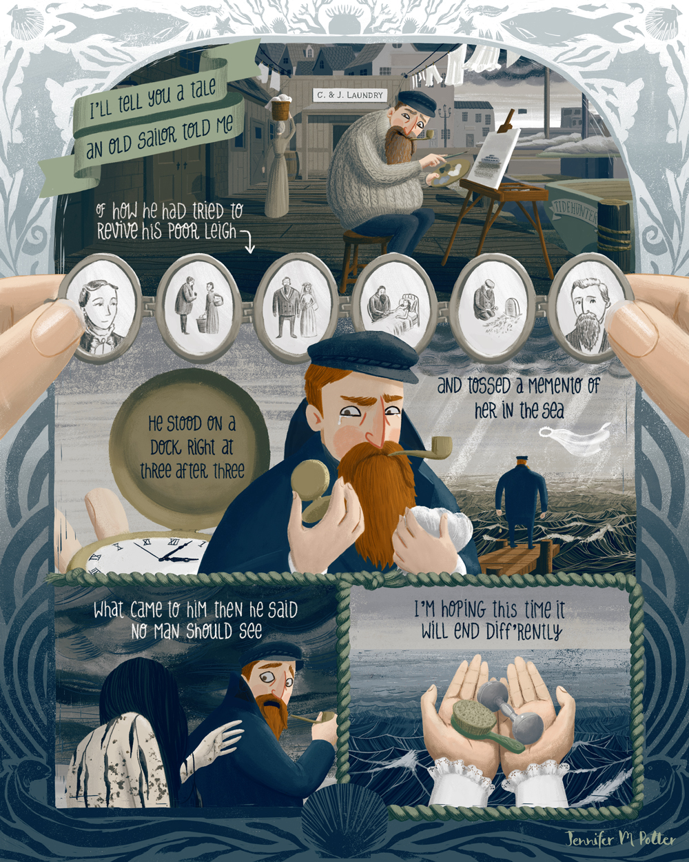
The second assignment was a graphic novel page. Now THIS was in my wheelhouse. I love comics and graphic novels. There was a short point in my teens when I collected comics, and I took Comic Book Illustration in college. I even spent a year on a webcomic. The point is, I could do this in my sleep, and more importantly, most of the competition couldn’t. That is to say, I figured it was probably foreign territory for most.

Here’s my submission:

aSailorsTale-blue.jpg

We had to use a collection of specific objects in this comic, and of course, text. The text could be anything, and it didn’t have to be an actual story, but I like storytelling, both verbal and visual, so I went all out and made a complete story with rhyme and a bit of a twist. It was fun, but I still lost sleep over it. Because at this point, even though I was no longer competing against 1000+ people, I was competing against 49 very strong artists, and that’s just as tough.

Why this round is hard:

This round is hard because there are multiple judges, and chances are, they don’t know you. They’re just looking for what they feel is successful art based on a set of criteria that Lilla gives them (and you). They may not even agree, so you have to generally appeal to everyone.

How to get an edge:

Your best bet is to be fairly well rounded, so hone your drawing skills and explore different markets. Chances are the judges will be from a variety of markets (like magazines, book publishers, product manufacturers and other art licensers/buyers), and they’ll be looking for different things like, composition, color palette, typography, storytelling, etc. The better you are at these things, the better you’ll do. And again, use a critique group. They’ll help you spot problems you may miss.

Beyond just generally being a very good illustrator, there’s one other way to get through round 2, and that’s with votes. Unfortunately your friends and family won’t cut it, so you’ll need to have a big network. The bigger the network, the more votes you can (probably) count on, so if you’re not working on building your following, get to it. It is a bit of a popularity contest, but it’s also worth noting that the person with the most instagram followers didn’t win the People’s Choice Award last year.

Even though I felt pretty good about my chances this round, I still lost sleep waiting for the results. Again it was a relief making it through, but the final round was the most intense of all.

The 2018 Global Talent Search, Round 3

In the final round we had to illustrate a spread from a children’s book. If you’ve ever taken the MATS Illustrating Children’s Books course, then you’d recognize the format. We were given three short passages and told to pick one and illustrate a spread and an (optional) character sheet.

Here are mine:

JENNIFER-POTTER-scene-lr.jpg
JENNIFER-POTTER-characterSheet-lr.jpg

By this point of the competition, I was super anxious. I was competing with successful, experienced artists, each one completely capable of winning. What’s more, I was competing against friends., people that I’d been in class with and really respected. I wanted all of us to win. I knew Lilla had picked more than one winner in the past, and sincerely hoped she’d take us all.

I can’t tell you how glad I am that she did.

Why this round is hard:

At this point, it’s anybody’s game, and I think more than anything, what’s hard is realizing what you have to lose. I started to believe that winning representation was possible, and realizing how much more work I had ahead of me if I didn’t win, was super stressful.

How to get an edge:

You get to communicate with Lilla and her team directly at this point. It’s a chance to demonstrate that you’re professional and easy to work with, so be charming! You also get to work with Lilla as you would an art director, so ask for feedback, and take what she tells you to heart.

That’s about it. I definitely got a few more gray hairs out of it and maybe shaved a couple of weeks off my lifespan. It was wild. I worked non-stop. I also got VERY lucky. My passion is for storytelling, and all of the assignments were book-based. It could not have gone better. If it was any other year…if there were any other assignments…I might have not have made it past the first round.

In retrospect it’s pretty funny. People sometimes ask me how to get an agent, but of course I got mine the most absurd way possible. So I guess my advice is to just drive yourself bonkers for a few months and then everything should fall into place. ( ❛ᴗ❛)

Jennifer M PotterComment
Bologna Children's Book Fair - What to bring

It's been just about a month since I attended the Bologna Children's Book Fair, and my head is still spinning from all the inspiration. It was my first trip to the fair, and I already want to go back!

ACS_0056.JPG
ACS_0064.JPG
ACS_0062.JPG

It was a bit of an accident that I went at all. I learned about the fair during my MATS Illustrating Children's Book class. Thanks to a good deal at Norwegian airlines, I was already planning to be in Italy at the beginning of the month, so after a bit of deliberating, I decided to change my ticket home in order to stay for the fair.

I spent the next couple of months hustling to get ready. There are a lot of blog posts dedicated to surviving the book fair, many with recommendations on what kind of materials to bring, but it's hard to find out how much to bring. Most of the posts I found just say bring as much as you can carry, which isn't entirely helpful. Especially when you're going to be hauling that stuff around for a month like I did!

IMG_3956.JPG

Here's what I brought:

Portfolio x 1
I looked into have a book professionally printed before the show, but there wasn't enough time, so I went with a nice 8.5" x 11" screwpost binder and printed everything at home. In retrospect I'm glad I did. Now I can easily update my portfolio rather than having to have the entire thing reprinted. And no one seemed to be put off by the portfolio in any way. It was a good size. I would steer clear of anything bigger. You don't always have a lot of space to put your portfolio down when you're showing it. I also wouldn't go too much smaller. It should be substantial enough to show detail.

Posters x 10 (used 4)
The posters are for the Illustrators Wall. I printed them at home on nice paper. I read a post from someone who'd brought four and said that hadn't been enough, because they kept getting removed or covered. Here's what I discovered: People are generally respectful and try not to cover up or remove your stuff, but if you have a nice looking poster with no tear strips or business cards, people might just take your poster. That's not necessarily a bad thing if it's a publisher loves your work and can't take a photo because of a dead phone battery. But it's probably better to have cards or tear strips. I made little paper card holders and attached them to my posters and restocked the cards periodically. I only put up two posters because I didn't want to take too much space from other illustrators. I gave the other posters away to publishers. I'd say the letter size was good. It was easier to pack than 11x17 or A3 would have been, but it was still noticeable enough.

Business Cards x 200 (used ~100)
I printed mine through Moo, so I was able to get several different backgrounds. This worked out well because when a publisher liked a specific image in my portfolio, I was able to give them a card (or a few) with the same image. Having a variety also helped me get a better sense for which of my work people responded to the most. That said I probably only gave out a couple dozen business cards. The rest were left with my posters at the Illustrators Wall. 

Postcards x 250 (used ~100)
I also printed these at Moo, but I didn't do a variety. Instead I chose my two best pieces and printed one on each side. Most of these were given to publishers. I gave them away at meetings and portfolio reviews, but I also left them with publishers who weren't seeing Illustrators. Postcards are perfect for this kind of thing, much more so than business cards, because eventually an Art Director will go through them, and if they like your art, they may just hang your postcard on the wall and keep you in mind when the right project comes up. For this reason I went with 5"x7" although I noticed most people went with 4"x6" (or A6). It's also fun to trade postcards with other illustrators, so you have a nice stack of souvenir art to take home!

Stickers x 200 (used ~20)
These were fun but completely unnecessary. I gave them to a few publishers, but mostly I just traded them with friends. I knew I wanted stickers anyway, so it wasn't a waste. I'd bring them again, but I'd cut down the amount just to save the packing space.

In the end I brought way more than I needed, or to put it differently, I wasn't as good about giving things out as I should have been. Printing gets expensive, and it's easy to be frugal with your stuff in an attempt to ensure your hard-earned dollars go to people who can help create opportunities for you, like agents and publishers, rather than fellow illustrators. In hindsight, that was the wrong approach. I saved my postcards thinking I'd send them to publishers after I got home, but I learned so much at the fair and got so much useful criticism, that the postcards already feel obsolete. I'm kicking myself for not leaving everything at the Illustrators Wall on the last day.

IMG_6800.JPG
IMG_6806.jpg
IMG_6779.jpg

I know people who've questioned if leaving stuff at the Illustrators Wall is worth it at all, since a lot of people who take your cards are other illustrators, but I did get contacted by a publisher who found me on the wall, so I think it's worth it.

If I'm lucky enough to go back, I'll bring:

1 Portfolio
4-6 Posters
100 Business Cards (with fewer backgrounds)
200 Postcards (possibly a mix of nicely printed 5x7s and some less expensive ones to leave at the Illustrator Wall)
100 Stickers
20-50 Concertina Portfolio Books (I want something to give to favorite publishers that will show my range of work, something that will look good hung up on the wall, and stand apart from the usual postcards)

And of course, no What to Bring to Bologna list would be complete without:

  • Blu-tack to hang your posters

  • Glue or tape - to attach your card holder to your posters if you go that route

  • Lunch - the lunch lines are long and you might be too busy with portfolio reviews

  • Water - hydration is key

  • Comfortable shoes - seriously, you will be on your feet all day for days

  • Layers - Bologna gets cold in March, but it can be warm in the convention center

  • A backpack - a one-shoulder tote gets old

  • A backup phone charger - you don't want to miss out on things because your phone is dead

  • A safe space for your wallet and phone - a friend got pick pocketed on the bus coming back from the fair. This is not uncommon in Italy. Be aware, and be safe!

  • Friends!

Okay that last one might not be the easiest, but it's important. It's always nice to have someone to eat lunch or dinner with, or to chat with while standing in line, but it's also helpful to have someone (or a group) who will share information about portfolio reviews and meeting opportunities. Look for illustrators who are going to Bologna and say hi to them before the fair on Instagram or Facebook. Start a group on Whatsapp, Facebook or Instagram, and make a plan to meetup for lunch on the first day. If that's not your thing, chat with people in line. See who's traveling on their own, and invite them to meet up later. A lot of illustrators go to the fair on their own, and it can be really overwhelming. A friendly face can go a long way! I was terribly nervous going to the fair, but I was fortunate to have connections with several illustrators from class and Instagram. My experience was twice as rewarding because of them!

IMG_6864.jpg
IMG_6728.jpg
IMG_6842.jpg