Kånken Art Contest Entry

Update: I won! *\(^o^)/*

Original post:

When Fjällräven announced their art contest to celebrate Svensk Form's recognition of the iconic Kånken bag as a work of art, I knew I had to enter. Fjällräven is a brand I can get behind. I love the design that is present in their products (who doesn't love that cute logo?), but I also appreciate their strong focus on animal welfare and environmental sustainability. In fact, the pattern itself results in almost no fabric waste. Plus, they're taking steps to help the endangered arctic fox. Yay foxes!

I knew from the beginning that I wanted my entry to not only feature the image of the Kånken bag, but also nod to its functionality. After all, good design isn't just how something looks; it's about the ideas it conveys and the problems it solves. In fact, I learned that the Kånken bag was originally designed to combat back problems in school children! I love learning stuff like that. It's great when a product you like has a compassionate story behind it.

In planning my piece,  I thought about the functionality of the bag. When it comes down to it, a bag is a bit of freedom—freedom to keep your hands unencumbered while knowing the things you need are safe and accessible when you need them. And what better way to convey that sense of freedom than through people enjoying the great outdoors?

Once I got the idea to feature hikers, I did some research on Swedish national parks. Fjällraven may have locations all over the world, but it's a Swedish brand and I wanted to stay true to that fact. I soon found my inspiration in the meandering waters of Rapasalet, a delta in the Rapa Valley in Lapland. It's so pretty!

Rapasalet

Rapasalet

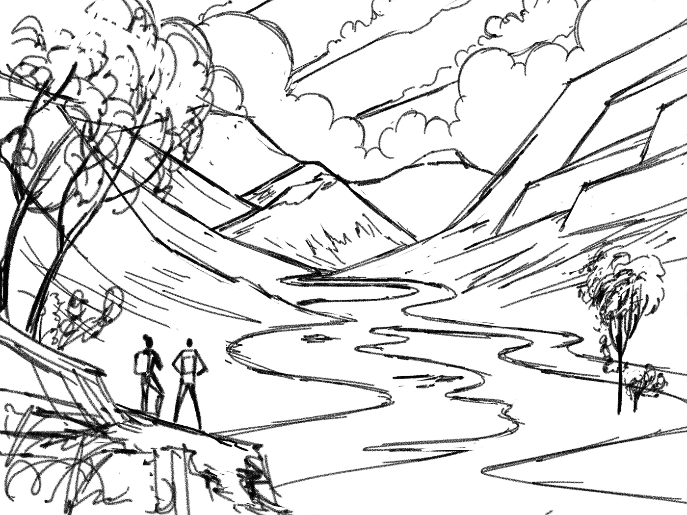
I started off by doing some quick thumbnails. When I had one I was happy with, I did a rough sketch to get a better sense of how the various elements would work in the environment.

Thumbnail

Thumbnail

Rough Sketch

Rough Sketch

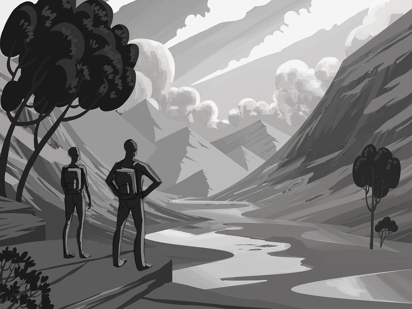
After that, I quickly painted in some rough values to determine how I wanted to light the scene. As you can see, I initially had the hikers smaller, but I felt that it wouldn't allow me to focus on the bags the way I wanted to, so I reworked the foreground and made them bigger. Once that was done I refined the values.

Rough Values

Rough Values

Refined values

Refined values

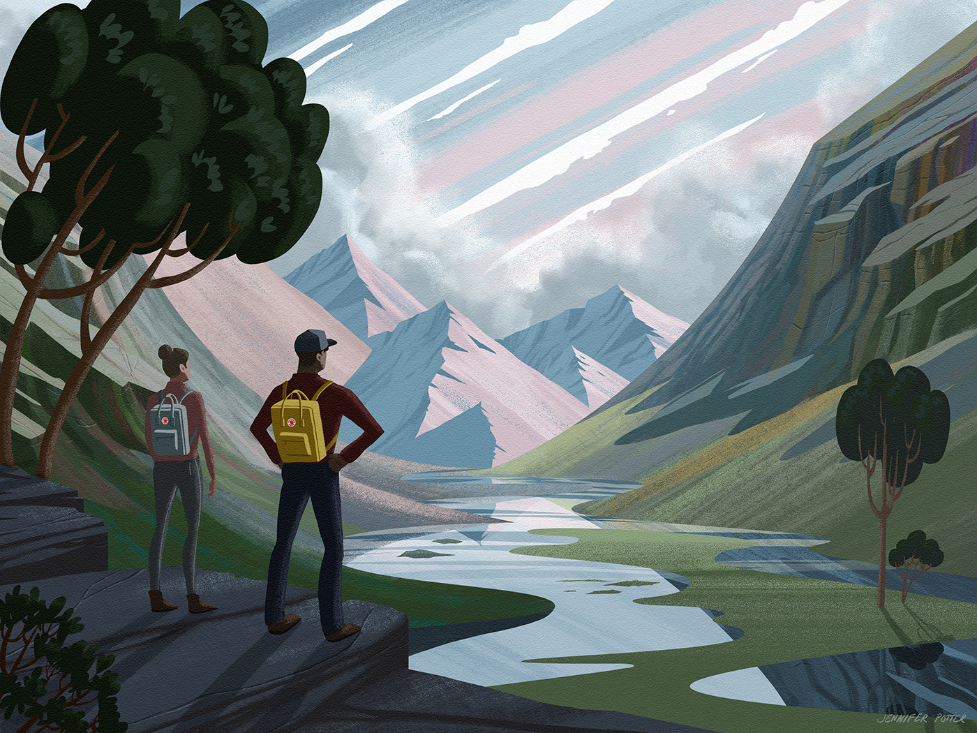
Now to the fun part: Color! I didn't even have to think about the palette I wanted to use, it was all there right in front of me as I browsed through the Kånken bags on Fjällräven's site. So many great colors! I chose the bags that I felt best fit the scene and started painting.

Color inspiration

Color inspiration

I'm really pleased with how it all turned out. I feel like the pieces really fell into place on this one, and whether my entry is selected or not, I'm super glad to have taken on the project. It was a good learning experience and I think it'll make a nice addition to my illustration portfolio!

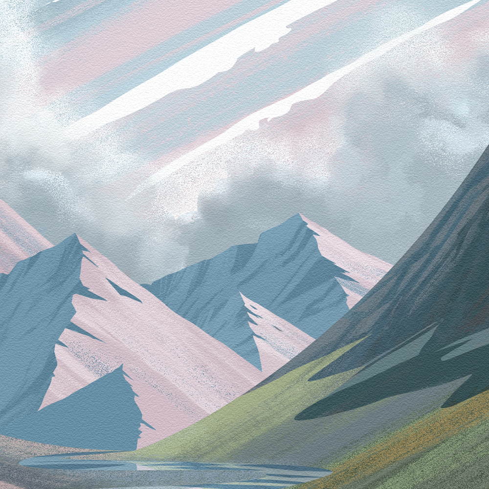
Here's the final piece. Scroll down for details!

kanken_detail03.jpg
Animals on the Go

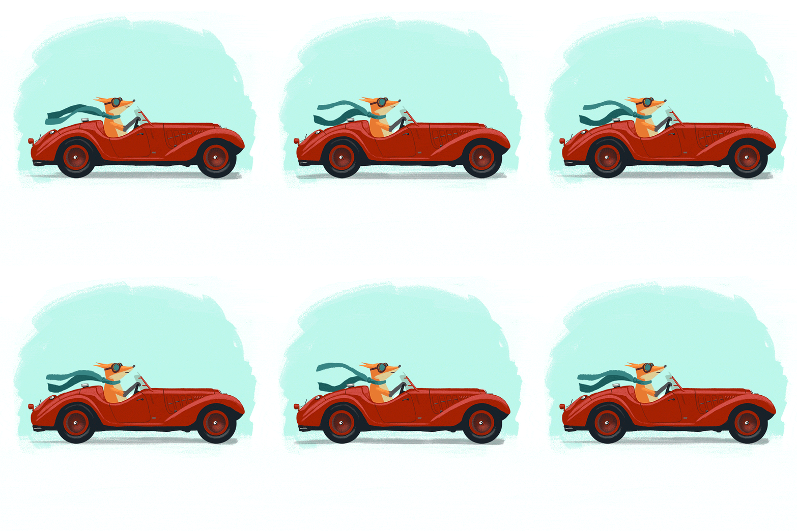
This is a series I started on a whim. Once day I felt like warming up by drawing a fox driving a convertible. I had a lot of fun with it so I decided to expand it into a series. I posted the fox on Instagram and asked people to suggest other animals and vehicles. I got a lot of great suggestions, but these are the four I went with. 

Monsieur Hulot's Paris Home from Mon Oncle

I had been looking at a bunch of pop illustration from the 50s, images that embraced the new age of modernity and convenience and welcomed the World of Tomorrow. I was feeling inspired by the clean lines, simple shapes, and flat color and I knew I wanted to express that by drawing a house. Of course, I intended to draw a modern house, but when I was combing Google for references, I came across this image from the film, Mon Oncle. The film itself is a commentary on modernity, and this storied old Parisian building stands in stark contrast to the newly contrived suburban home of the antagonists.  

Although this house isn't what I set out to draw, I was immediately drawn in. All the elements were there, clean lines, simple shapes and...well maybe the color wasn't exactly flat but I could see how it would work.

Here's my process:

This was a lot of fun. I really enjoyed expressing the detail through minimal shapes and rendering the home in the very style it was intended to parody.

Here's the final piece. Scroll down for details!

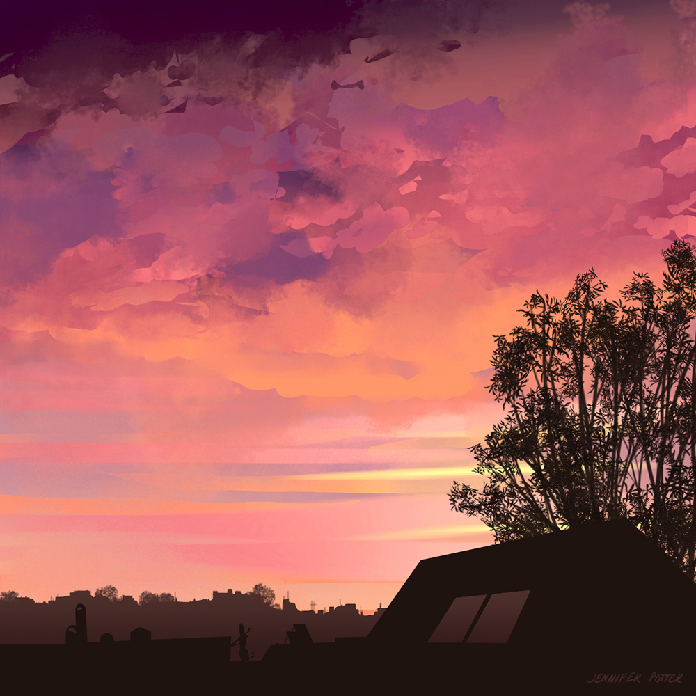
Cloud Studies

This is a series of studies I did with the intention of improving my ability to draw stylized clouds. I'd previously been relying on a variety of photographic brushes to paint clouds, but it felt like a crutch, and I wanted to see if I could render them with more intention. These studies are done from photos I took, most of which are from around my home in San Francisco.

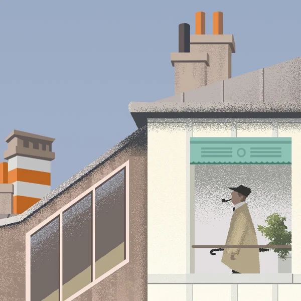
Kiki's Delivery Service (Lily in the Window)

This is a piece I did for fun after seeing a sketch by Pascal Campion called the The Right Spot. Something about the room in his sketch made me think of Kiki's attic and I just had to merge the two. I originally had a flower pot in the window, which is there in the film, but decided that the image would tell a better story if I replaced it with Jiji's love interest, who is apparently called Lily in the film's credits. 

Jennifer M PotterComment
Afternoon Tea

One day while at a local tea house with friends, a friend was talking about some of the portraits I'd been drawing. One thing led to another and I left the tea house with a plan to draw all of us, tea house and all. This is my interpretation of the moment. I created a very stylized version, and really pushed the color and light.

Jennifer M PotterComment
Penny in the Window

This is a sketch I did of my step mom's Jack Russell Terrier, Penny. It's from a photo I took over the Christmas holidays. I liked the lighting a lot, so I thought it would be a good challenge to recreate the scene in photoshop. I'm particularly pleased with how the lens flare turned out, which would have been easy to do with the lens flare filter in Photoshop, but created my own.

Jennifer M PotterComment
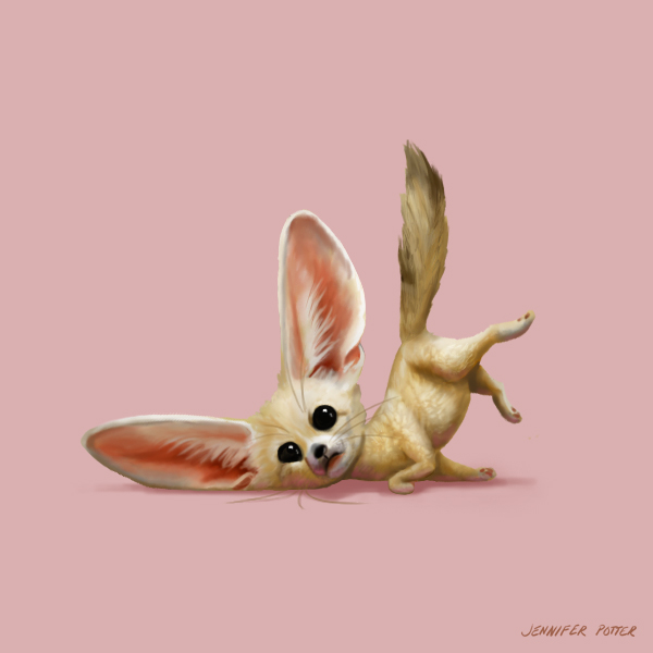
Warm-Ups

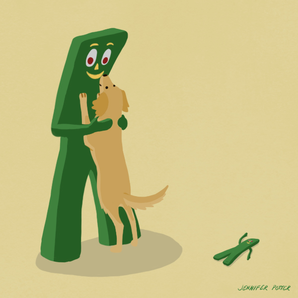
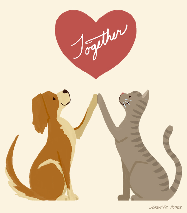
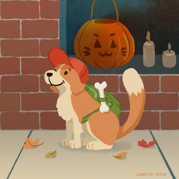
When I don't have a pressing deadline, I like to make time for fun warm-ups, that generally feature simple, cheery designs, soft palettes, and—more often than not—dogs. 

Jennifer M PotterComment
Holiday Card 2016

Here's a holiday card I designed to send out to friends and family in 2016. I really liked the way it turned out, so I'm planning to expand on the woodland theme this year.

Jennifer M PotterComment
Tonko House's Painting with Color and Light: Week 2

Here's some of the work I did for the second work of Tonko House's course over at Schoolism. The assignment was to draw images from life, in grayscale, with overcast/ambient light. I'm fortunate to have a lot of light in my apartment, but that made it hard to find opportunities to draw without strong shadows. I ended up waiting for dusk, but that's a limited time, so I had to work faster than I typically do.

No. 1

This second image is my favorite. It looks fairly photorealistic to me, which means I did a pretty good job capturing the light. The pictures on the wall are prints by Ilya Bolotowsky.

No. 2

Tonko House's Painting with Color and Light: Week 1

No. 1

I've been drooling over the work of Dice Tsutsumi and Robert Kondo for quite a while, so once I discovered their course over on Schoolism, I had to sign up.

If you're not familiar with Dice and Robert, they're both Pixar veterans who served as Art Directors on films such as Ratatouille, Toy Story, and Monsters University. A couple of years ago they went off on their own to form Tonko House, where they made the wonderfully heartfelt and beautiful short film, The Dam Keeper. If you haven't seen it yet, you can stream it over on Amazon. It's worth the three bucks.

The set up at Schoolism is neat. For $144 you can stream any of the courses for a full year (it costs $1 to switch courses). I hesitated a little because I was concerned about getting my money's worth. After all, there are a ton of free tutorials on YouTube, including some from Dice and Robert. So why spend the money on the course? Well, as it turns out, the $144 doesn't just get you access to the lessons, it gets you access to the feedback the instructors gave to former students, which to me, is just as valuable. What's more, both the lessons and feedback are in video. It's enlightening to watch your instructor go into a student work and make it much stronger through hands-on overpainting, all the while reinforcing the week's lessons. The video feedback makes the course feel more like a college course than anything I've experienced online. It is reminiscent of being in a classroom, listening attentively as each student's work is critiqued.

No. 2

Week 1 of Painting with Color and Light focuses on ambient light. The idea is to really observe subtleties in light, shadow, and color in a diffuse light environment. This can be a bit tricky if you live in a one bedroom apartment with east- and west-facing windows, but I made it work. I was fortunate enough to get a few overcast days, which have been troublingly rare in the Mission since the drought began. Thank you, El Niño.

No. 3

It's impossible to be objective with your own work, but in the first week I can see some improvements and some things that I am still struggling with. One of my biggest issues is over-rendering, i.e., doing more with less. I'm not looking to achieve realism, but I am looking to convey the subjects' essence quickly and accurately. I think I got close to that idea with the plate in the first image. Although the fruit needs to be modeled more and grounded with darker contact shadows, I think the bottom left quadrant of the plate is rendered to a degree that sells it's shape without being overly fussy. 

No. 2 and no. 3 were a bit trickier. I tried to challenge myself with more complex compositions, but I took too long with them. The sun came out, and I lost the light, so I had to work on them over the course of a few days. In both images I got a little too absorbed in certain places and rushed others without considering the respective focus of each composition. Just because I'm observing and painting from life, doesn't mean I shouldn't be using creative license to enhance the composition.  

No. 4

No. 5

In nos. 4 and 5 I tried to simplify. I went for a paired down composition specifically so that I could focus on doing more with less. In the fifth image, I got closer to where I want to be.  It's far from perfect, but I think some of the materials—the wood, glass, and metal—read as intended. Compare this to the less-realized study in no. 1, and if feels like quite an improvement. And that's just the first week!