Here's a series of famous dogs. It started off as one of those 100 days projects on Instagram, but I only made it a couple of weeks in before life got in the way! I did some research and made a list of about 50 dogs that contributed to humanity in one way or another, so there's still plenty of material to work with. Hopefully I'll get a chance to add more!
Update: I won! *\(^o^)/*
Original post:
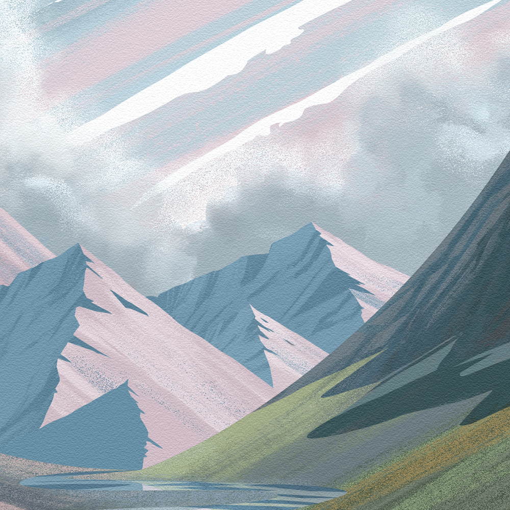
When Fjällräven announced their art contest to celebrate Svensk Form's recognition of the iconic Kånken bag as a work of art, I knew I had to enter. Fjällräven is a brand I can get behind. I love the design that is present in their products (who doesn't love that cute logo?), but I also appreciate their strong focus on animal welfare and environmental sustainability. In fact, the pattern itself results in almost no fabric waste. Plus, they're taking steps to help the endangered arctic fox. Yay foxes!
I knew from the beginning that I wanted my entry to not only feature the image of the Kånken bag, but also nod to its functionality. After all, good design isn't just how something looks; it's about the ideas it conveys and the problems it solves. In fact, I learned that the Kånken bag was originally designed to combat back problems in school children! I love learning stuff like that. It's great when a product you like has a compassionate story behind it.
In planning my piece, I thought about the functionality of the bag. When it comes down to it, a bag is a bit of freedom—freedom to keep your hands unencumbered while knowing the things you need are safe and accessible when you need them. And what better way to convey that sense of freedom than through people enjoying the great outdoors?
Once I got the idea to feature hikers, I did some research on Swedish national parks. Fjällraven may have locations all over the world, but it's a Swedish brand and I wanted to stay true to that fact. I soon found my inspiration in the meandering waters of Rapasalet, a delta in the Rapa Valley in Lapland. It's so pretty!
Rapasalet
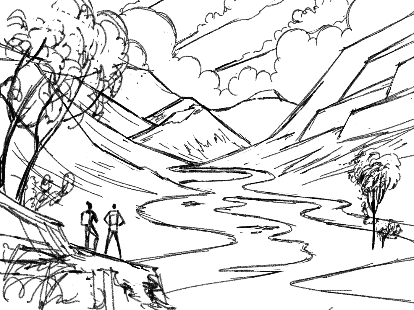
I started off by doing some quick thumbnails. When I had one I was happy with, I did a rough sketch to get a better sense of how the various elements would work in the environment.
Thumbnail
Rough Sketch
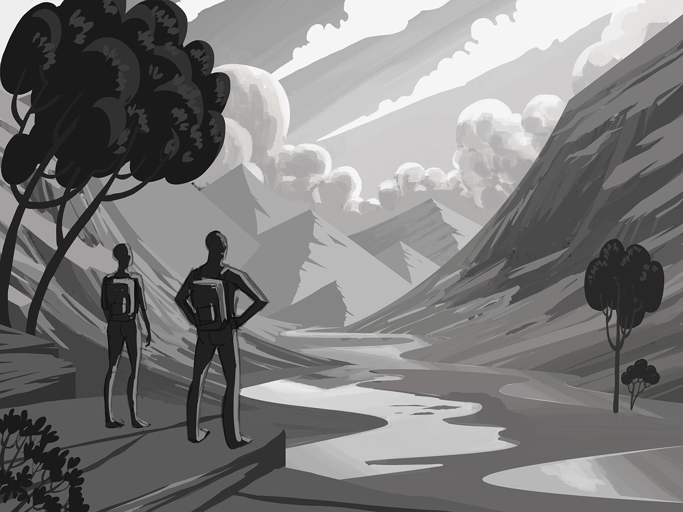
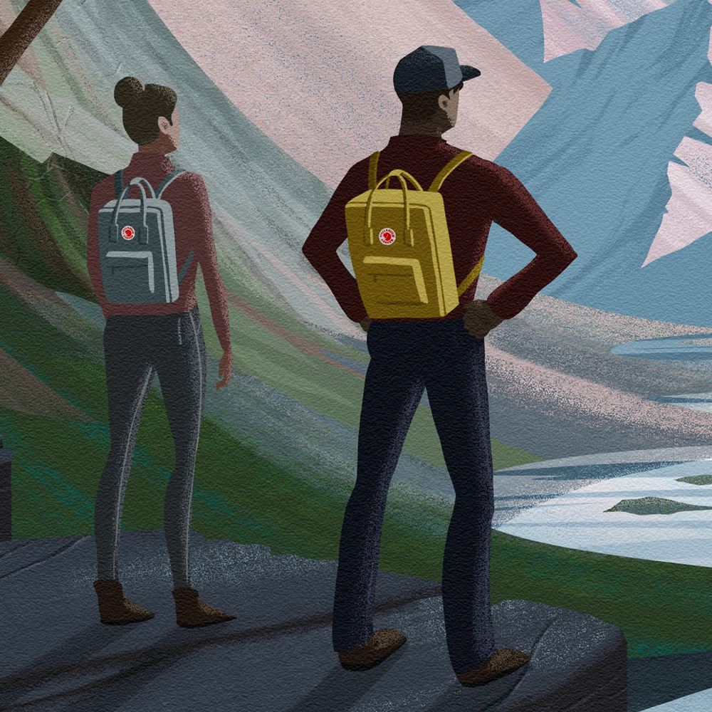
After that, I quickly painted in some rough values to determine how I wanted to light the scene. As you can see, I initially had the hikers smaller, but I felt that it wouldn't allow me to focus on the bags the way I wanted to, so I reworked the foreground and made them bigger. Once that was done I refined the values.
Rough Values
Refined values
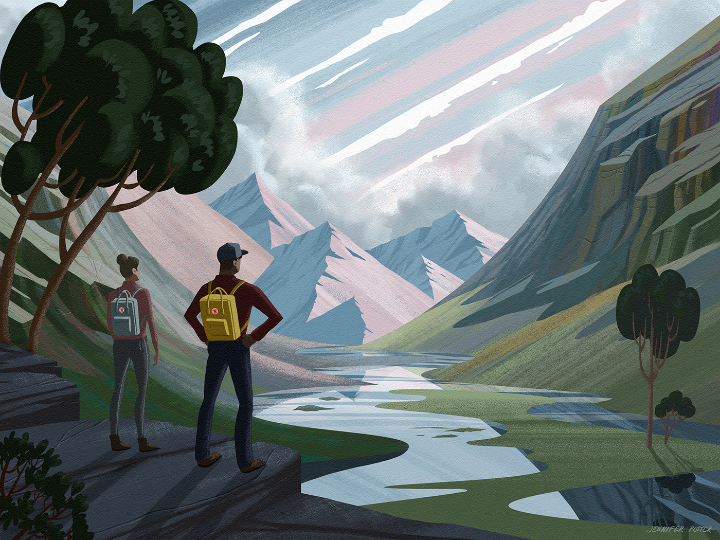
Now to the fun part: Color! I didn't even have to think about the palette I wanted to use, it was all there right in front of me as I browsed through the Kånken bags on Fjällräven's site. So many great colors! I chose the bags that I felt best fit the scene and started painting.
Color inspiration
I'm really pleased with how it all turned out. I feel like the pieces really fell into place on this one, and whether my entry is selected or not, I'm super glad to have taken on the project. It was a good learning experience and I think it'll make a nice addition to my illustration portfolio!
Here's the final piece. Scroll down for details!
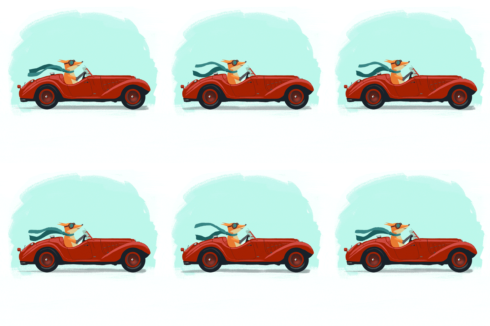
This is a series I started on a whim. Once day I felt like warming up by drawing a fox driving a convertible. I had a lot of fun with it so I decided to expand it into a series. I posted the fox on Instagram and asked people to suggest other animals and vehicles. I got a lot of great suggestions, but these are the four I went with.
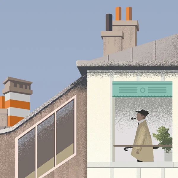
I had been looking at a bunch of pop illustration from the 50s, images that embraced the new age of modernity and convenience and welcomed the World of Tomorrow. I was feeling inspired by the clean lines, simple shapes, and flat color and I knew I wanted to express that by drawing a house. Of course, I intended to draw a modern house, but when I was combing Google for references, I came across this image from the film, Mon Oncle. The film itself is a commentary on modernity, and this storied old Parisian building stands in stark contrast to the newly contrived suburban home of the antagonists.
Although this house isn't what I set out to draw, I was immediately drawn in. All the elements were there, clean lines, simple shapes and...well maybe the color wasn't exactly flat but I could see how it would work.
Here's my process:
This was a lot of fun. I really enjoyed expressing the detail through minimal shapes and rendering the home in the very style it was intended to parody.
Here's the final piece. Scroll down for details!
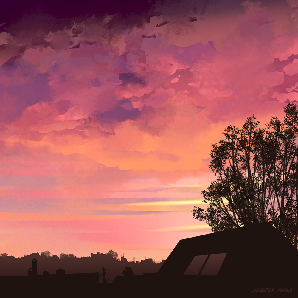
This is a series of studies I did with the intention of improving my ability to draw stylized clouds. I'd previously been relying on a variety of photographic brushes to paint clouds, but it felt like a crutch, and I wanted to see if I could render them with more intention. These studies are done from photos I took, most of which are from around my home in San Francisco.


