A Week in My Studio

I've been wanting to blog for months but it felt like such a production. Then someone said: don't create, just document. So here's a week.

Monday

It’s Monday morning and I'm plugging graphics into the community site I’ve been working on. They look... fine? I drew them last week and was pleased then, but now I'm not sure. Website design is fully in my comfort zone. I did it for ages. But I realized I’ve always worked with someone else’s text. Drawing images before I actually know what I’m saying is maybe putting the cart before the horse. I'm trying not to spiral into perfectionism about it. It's fine. Probably fine.

Sketchbook showing hand painted art supplies

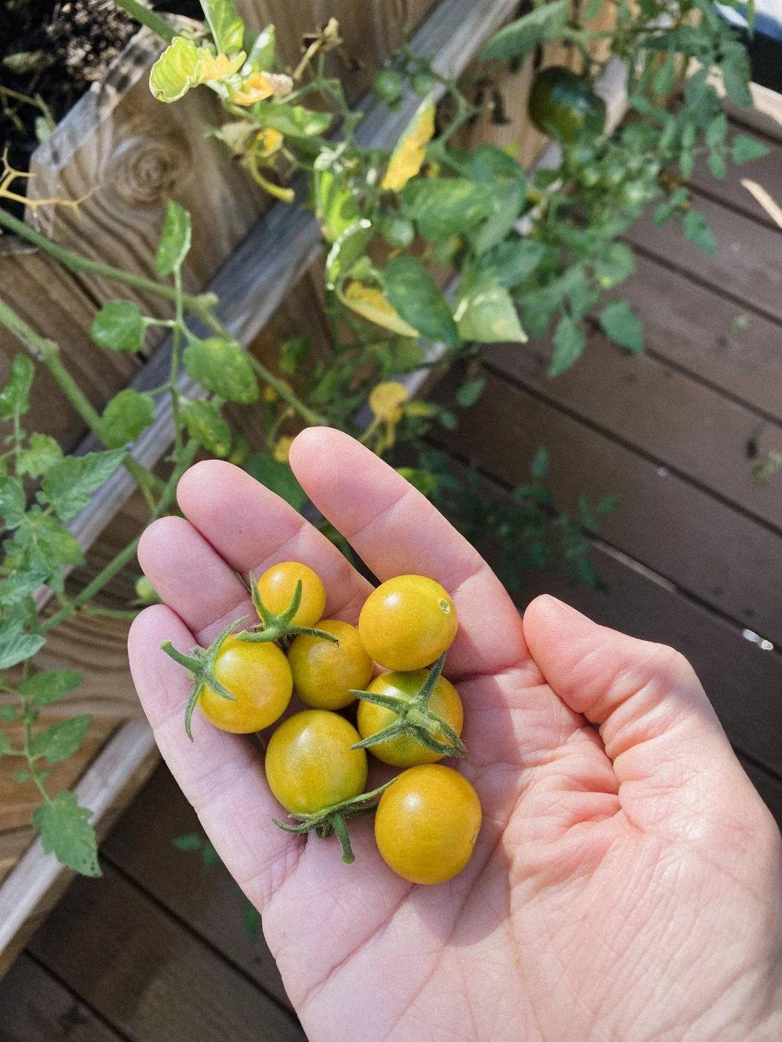
The weather was lovely, so Paul grilled for dinner. Impossible burgers and fresh corn and eggplant from the CSA. I used to hate eggplant. Now I love it. I don’t think it’s a texture thing, because I still don’t like it when it’s not fully cooked through. It needs to be soft, to almost disappear in your mouth. Paul is happy because he loves cooking with it. He has so many tasty recipes for it. Have my tastes changed so much? Makes me wonder what else I might learn to love. Olives, maybe? Blue cheese?

Tuesday

On Tuesday I made esquites with the leftover corn. We somehow ended up with three unopened bags of tortilla chips after the block party last weekend, so corn salad seemed like the obvious solution. Mayonnaise, lime juice, garlic, chile pepper, cotija cheese. So yummy with the charred sweetness and crunch of fresh corn!

Detail shot of the printed proof of the puzzle I'm working on

After lunch I did puzzle edits. The job was done months ago—finished, paid, put away—but then the client wanted changes after seeing proofs. Not small ones. There’s always a level of guesswork in estimations, but I sent them a rate that felt fair—a balance between a good rate if it went quickly and a reasonable rate if it dragged.

It's dragging.

I've been timing myself and I’ve already sailed past the "good money" mark, and now dipping below "reasonable." But I like this client. They’re good people, and I want them to feel good about the work they’re getting, so I keep noodling around, even adding a few details they didn't ask for but will probably appreciate.

Wednesday

Wednesday morning, back to the community site. Writing the landing page, trying to explain what I'm creating. It took forever to find the right words. I hope people get it. Thinking about making new illustrations after all.

Handful of cherry tomatoes from my garden

Lunch was the leftover esquites with a fried egg, fresh avocado, and tomatoes from the garden. More tortilla chips, obviously. We're going to be eating chips until 2025 at this rate.

Still working on the puzzle in the afternoon. Still over my estimate. Still adding little touches because they feel right.

Thursday

It rained all day Thursday.

I did laundry in the morning and then finally sat down to work on blogging. I've been wanting to do this for ages but haven't prioritized it. Or—I'm trying to reframe this—I haven't practiced prioritizing it. Time is finite. If I want to do something, I have to take time from something else. Which means deciding it's worth it.

So I guess I'm practicing deciding it's worth it.

Thumbnail sketches of potential images for the community website

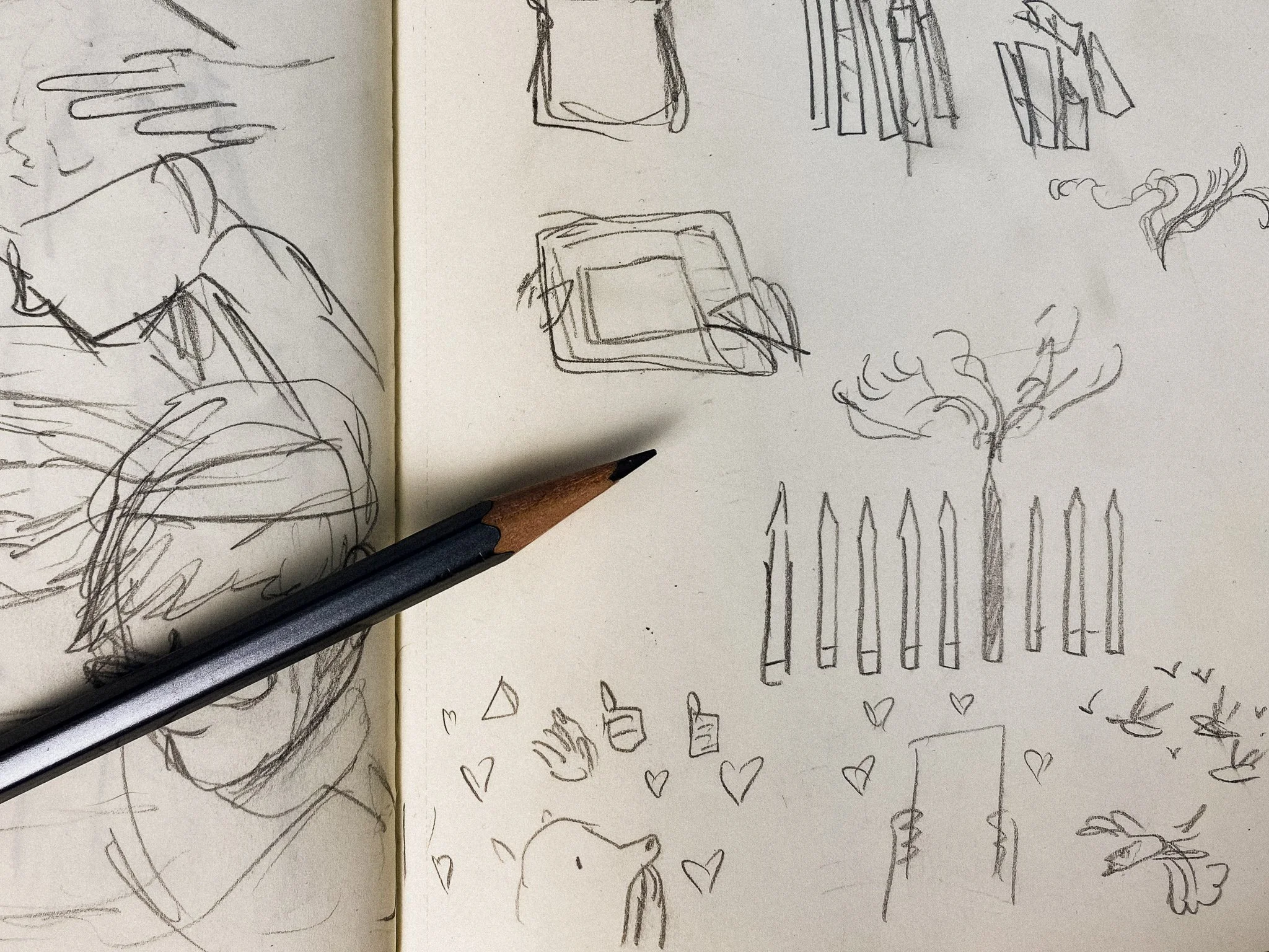
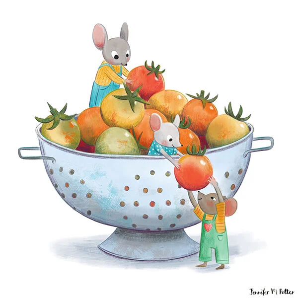
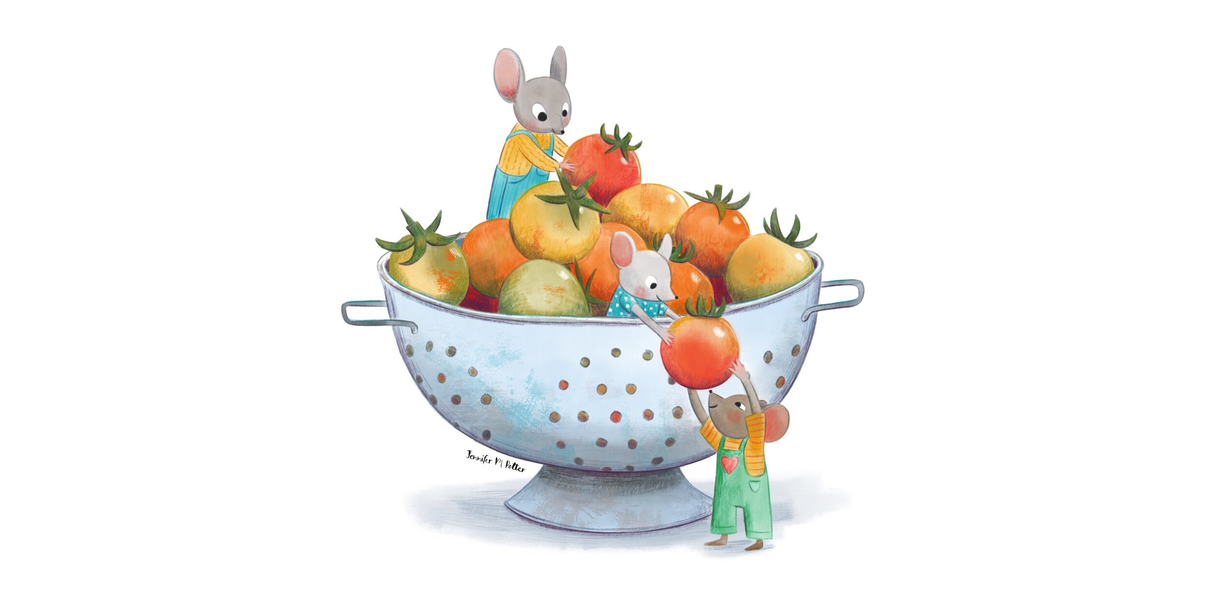
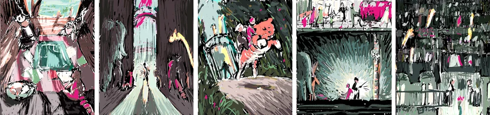
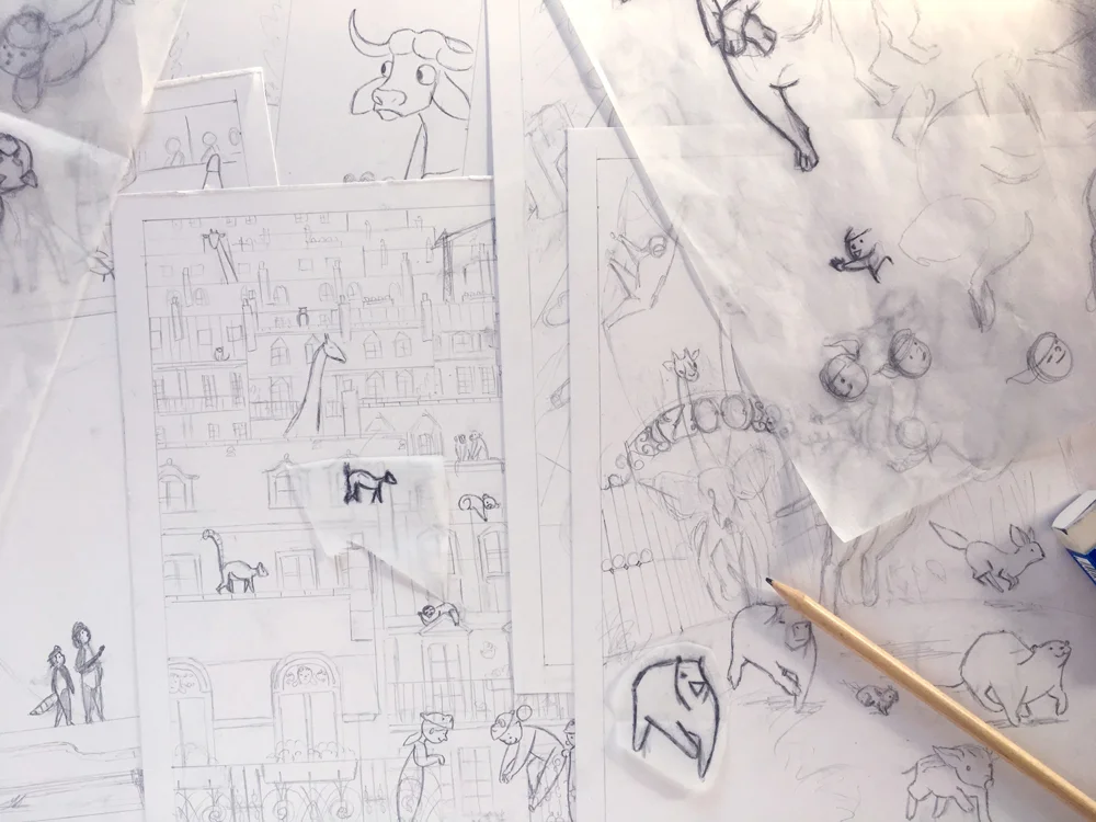
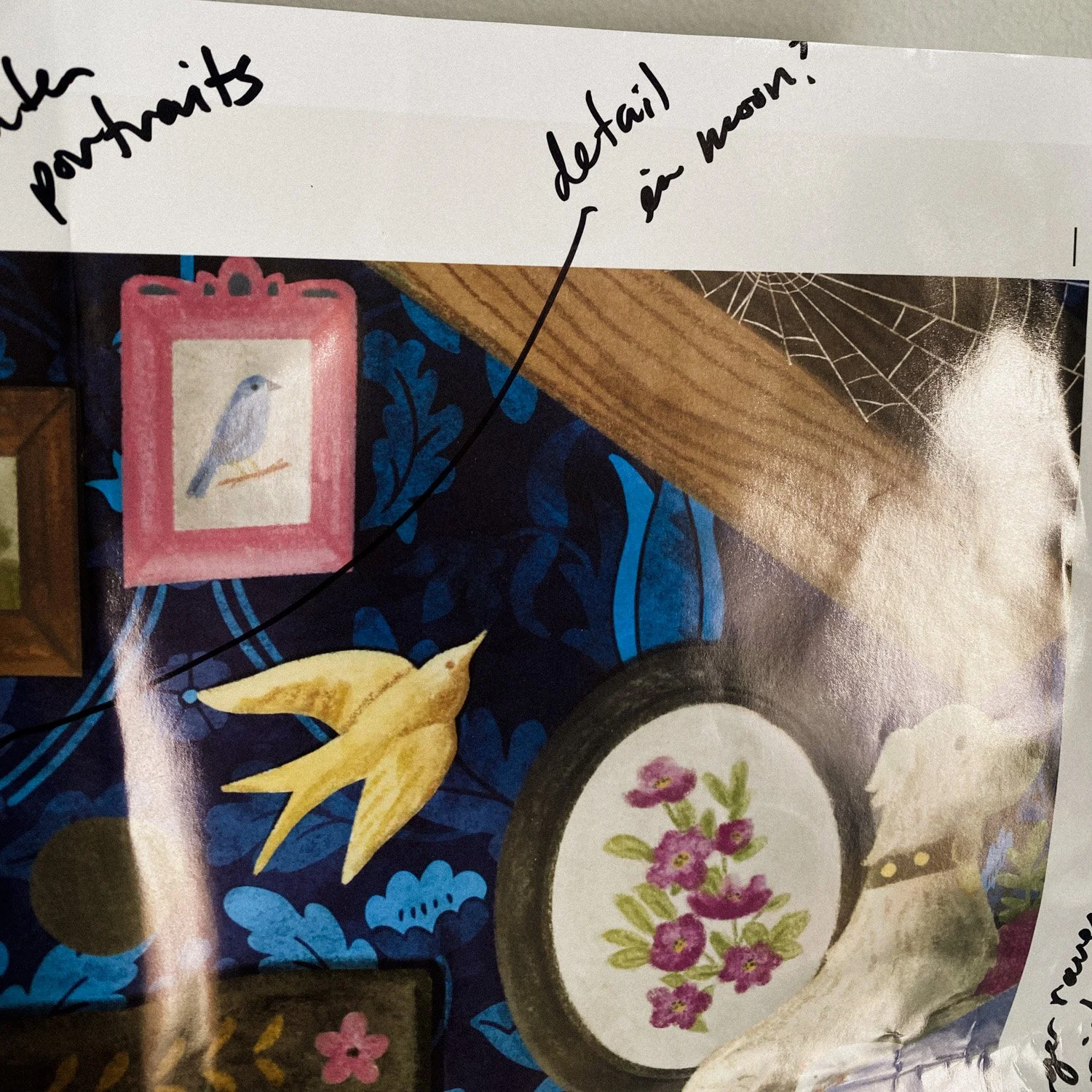
In the evening I sketched new thumbnails for the community landing page. The old ones didn’t have enough visual storytelling. And it needs visual storytelling—it's a site for illustrators, after all.

I think this would be much easier if I wasn’t an illustrator. Then I could use stock photography and call it a day. But I don't want stock anything, so I need to make something custom. Simple. Meaningful. Which is literally my job, so I should probably trust myself to do it okay.

Trying not to overthink.

Friday

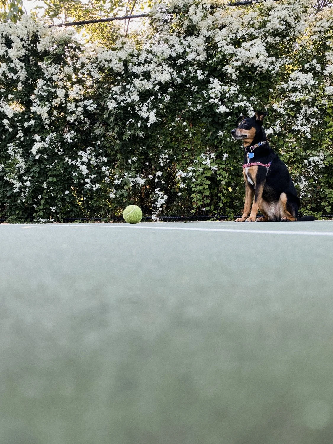
Friday was delightfully sunny. I took Frisket to the park to play fetch.

Frisket sitting with her ball on the tennis court

Then she got to see her good friend Chowder (a dog), and her good friend Ray (a human). Ray always has treats at the ready. Pretty sure Frisket thinks he buys them just for her. They're besties like that.

I cleaned the studio for fifteen minutes. Trying to make it a daily thing. Even five minutes makes a difference.

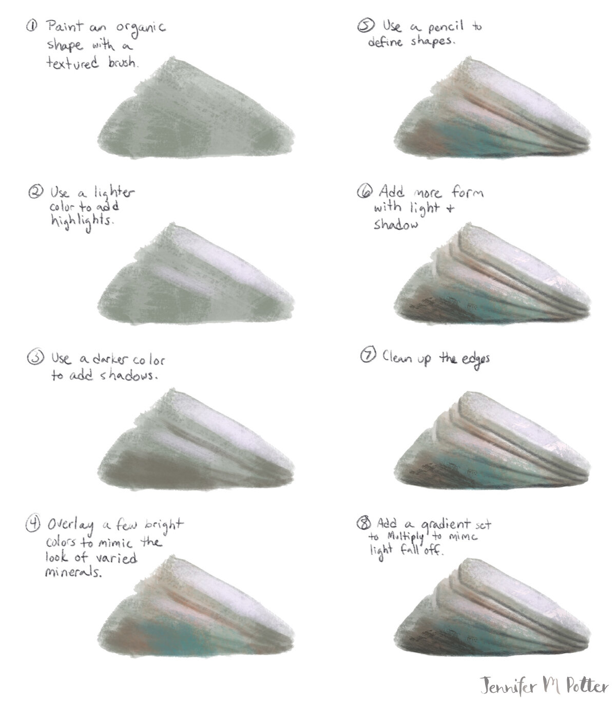
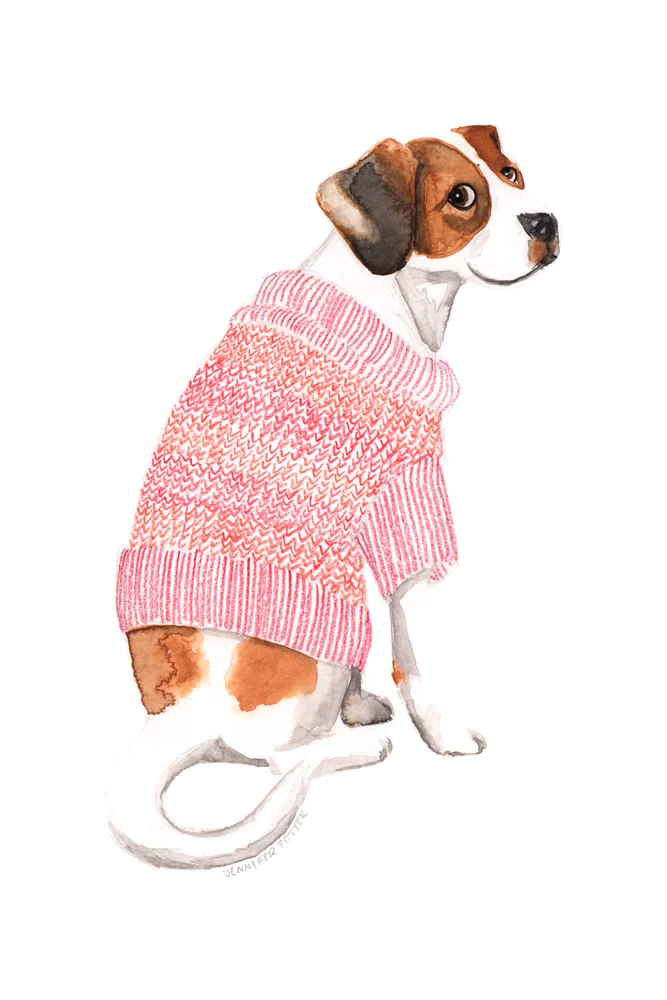
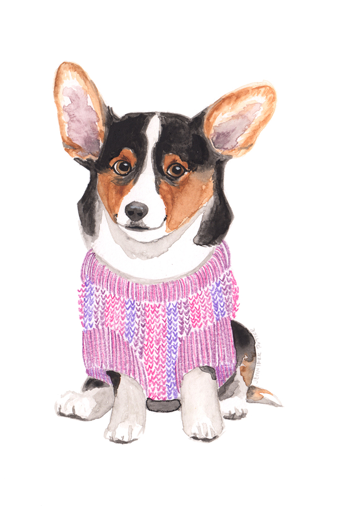
Then I drew. I selected a couple thumbnails from yesterday and got to work on final images. Naturally I didn't like where it was going for the first hour. Just had to keep pecking at it until it got better. Oh the ugly phase. It’s a part of every piece, and yet I still have to remind myself that I just have to keep going and I’ll make it through to the other side.
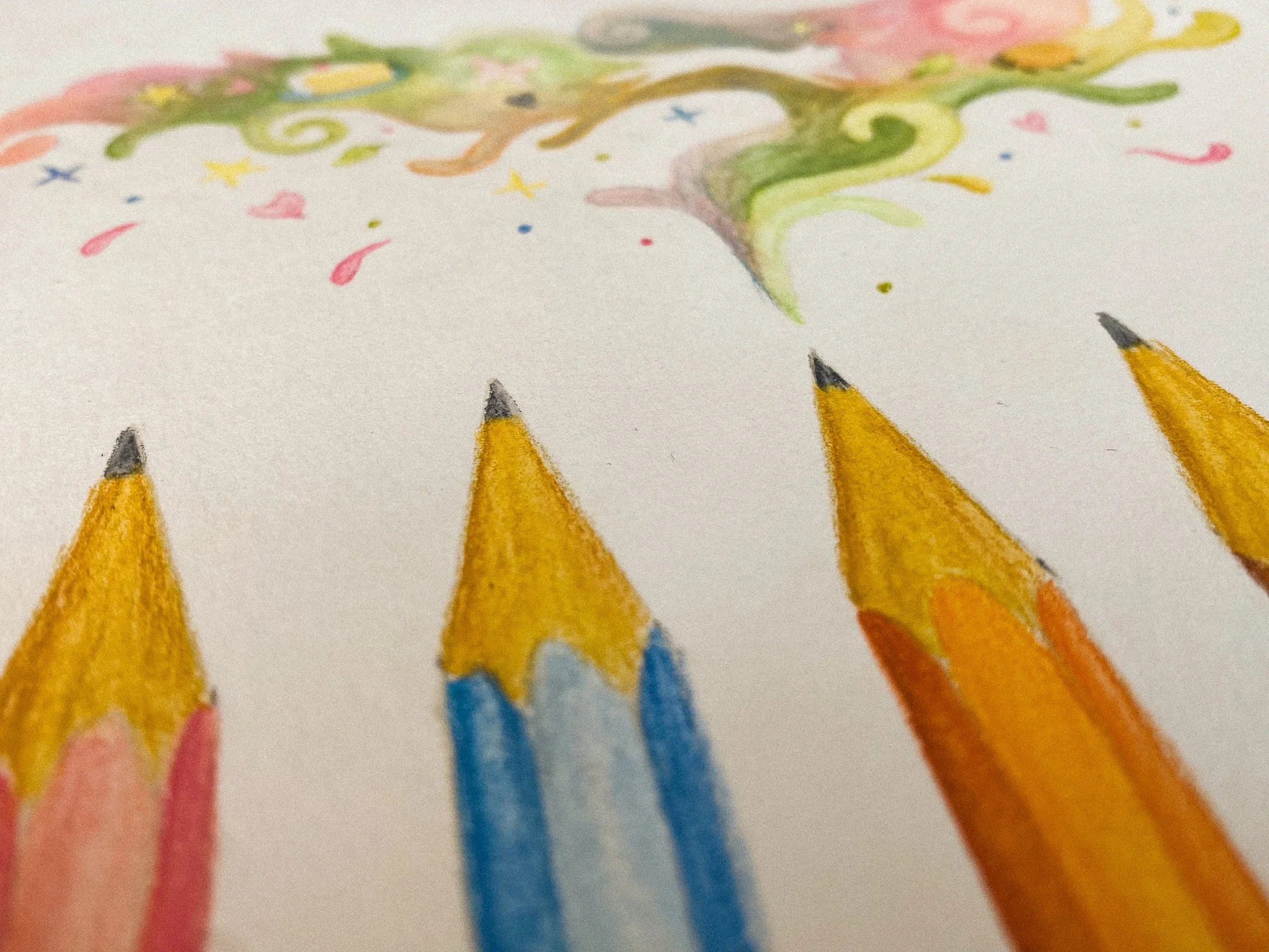
Illustration of pencils and colorful flourishes

I made it through.

Weekend

We booked hotels for South America on Saturday. Paul has a conference in Buenos Aires, but we're starting in Montevideo and taking a ferry across. Can’t wait!

Inside shot of the old cathedral where the wedding was held

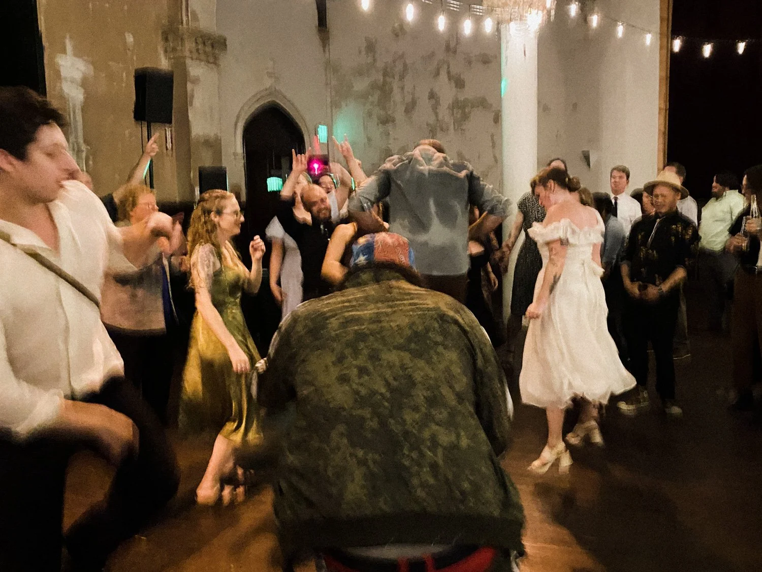
In the evening I went to the wedding of an old classmate from the Potters Guild. It was in a beautiful old church that had been converted to a community space. It was a great time. Good food, delicious cocktails, lots of dancing. Were there pottery moves on the dance floor? Possibly.

After the ceremony, I got a text from my stepmom saying my dad was going to the hospital. He’s recovering from severe acute pancreatitis and complications relating to it, so he’s been in and out of the hospital for months. He’s okay. But it’s stressful, and I was happy to be surrounded by friends and an atmosphere of celebration. There are worse things than dancing away your anxiety to Gaga and ABBA.

The bride and groom in midair

Sunday was a cookout at Paul's parents' house. His dad's theory: if you're lighting the grill, might as well cook everything. So. Much. Sausage. And more corn. And more eggplant. And zero complaints.

The Secret Treehouse
scenes-secretTreehouse-text-lr-sig.jpg

If you’ve been following me on Instagram, you’ll see I launched The Secret Treehouse with a few picture book illustrator friends last week!

The Secret Treehouse is a project we’ve been working on behind the scenes for a few months. Right now it’s part community/part blog/part art collective and we’re excited to see what this little tree will grow into. We want It to be a place to talk about art and process and tips. A place to share resources and to talk about what it’s really like to be a professional illustrator. Is it really a dream career? What’s the money really like?

There are a lot of possibilities, but one of the first resources we’re excited to share are portfolio reviews. We were all lucky to get direct insight from professionals early in our collective journey to becoming illustrators, and we agree that it was one of the most valuable things we could do.

But it comes at a cost. Courses and conferences, not to mention travel, are expensive and out of reach for a lot of aspiring illustrators. We’d like to make professional feedback more accessible.

To celebrate the launch, we plan to do a drawing for some free ones (everyone who signs up for our newsletter will automatically be entered ), but we hope to make them available in the long term.

We also plan to add new artists over time. Right now, we’re starting small, but we want to include new voices and perspectives, artists whose work and spirit excites us and hopefully you, too.

I hope you will join us as we strive to make The Secret Treehouse a wonderful place to hang out!

Jennifer M Potter
Fresh Picked Cherry Tomatoes

I have a self-professed brown thumb. Or I did. I guess that might not be true anymore as I have quite the container garden on my deck. My crops are huge right now, and my neighbors are impressed, and I think a bit surprised when I tell them this is my first year successfully growing anything more than houseplants.

tomatoes-6.jpg

It’s all thanks to Monty.

Last summer, I was holed up in my one-bedroom apartment feeling absolutely miserable. Don’t get me wrong, it was a great apartment, top floor, lots of light, right in the middle of San Francisco’s Mission District. And because we got it in 2008 and it had rent control, we were paying about half what similar apartments were going for. It didn’t matter that it had no outdoor space, because the whole city was our back yard. But then the pandemic hit. And the heat waves. And the wildfires.

That summer, we couldn’t go anywhere because of lockdown. There was no place to go. And even though we could have gone camping, we chose to heed the guidelines of no unnecessary travel. It wasn’t all bad. During nicer weather, we could bike to the park and have a distanced picnic with friends. But when ash from the wildfires lingered over the city making the air toxic, we couldn’t even open our windows, much less go outside.

So, like a lot of people, I resorted to escapism. I spent a lot of time dreaming about a home with some kind of outdoor space where I could have a garden. That meant looking at homes on Zillow and watching A LOT of gardening shows.

tomatoes-5.jpg
tomatoes-2.jpg

I suspect Monty Don is a household name in the UK, but I’d never heard of him until last summer. I learned a lot from him and his gang on Gardener’s World. I also learned a ton from a show called Grow Cook Eat, which is nicely organized by crop. Even though I had no way to apply what I was learning, it surprises me how much I soaked in. I can identify way more plants now. I even know the latin names for some of them. And the difference between espalier and fan-trained trees. And what stepover apples are!

So when my Zillow journey led us to buy a house back home near family (for less than we were paying for our SF apartment), of course I started a garden of my own. Our yard is by no means expansive, but I’m happy to start small. I put a few containers on the back deck in which I’m growing lettuce, cherry tomatoes, tomatillos, five different peppers (including two we inherited from our neighbors), and a whole bunch of herbs. It’s basically a salsa garden.

I’ve been planting, watering, pruning, and tying back plants for months and now it’s finally harvest time! It’s a nice feeling going out to water the plants in the morning and coming back in with a colander full of produce.

tomatoes-4.jpg
tomatoes-1.jpg

Next year I’m definitely adding more fruit. I want to have a few different berry bushes, plus some kind of fruit tree. My neighbors have figs, and I kind of want one, but maybe I’ll go with a plum and see if they’ll trade.

Do you have a garden? If not, what do you wish you could grow?

Jennifer M Potter
Stop Overthinking. Free the Fish.
sardineTin-banner.JPG

This post is for me, but also for all of you who tend to overthink things. Even now, not even two sentences in, and I find my mind wandering off, evaluating if this is really how I want to begin this post. But nope. I’m done with that. I’ve let it get in the way of things I want to do for far too long.

See, I want a blog. I have so many ideas swimming around in my head, and they all want out. I mean it’s completely crammed in there. Like sardines. Little swimming sardine ideas. That’s no way to run a brain. An aquarium? Sure. But not a brain.

So here I am to share my fishy little brain with you, in all its overthinking weirdness. AND, I want to be a good example, because I want your little fishes to get out, too. I know for a fact that I am not the only one who over-analyzes things into oblivion. I’m not the only one that will come up with a solid idea and then think about it so much, trying to make it just right, that eventually my inner critic will talk myself right out of it.

So I’m back. I’m here, I’m gonna share. And I want you to share, too. Give yourself permission. Don’t do it for the ‘gram. Don’t do it for ‘tok or the ‘book or the ‘ter (that’s how that goes, right?). Do it for yourself. Get your thoughts and your ideas and all your lovely, brilliant, psycho weirdness out on paper or text or what have you, and set them free!

I hereby grant myself permission to share imperfect artwork, tutorials, insights, etc. I do NOT give myself permission to chicken out. This isn’t about chicken anyway. It’s about fishes. And the fishes need our help.

Jennifer M Potter
Drawing Rocks (+tutorial)
rocks-title.jpg

You wanna know something? I still struggle with style. I’ve been illustrating professionally for over two years and I don’t feel like I’m anywhere close to figuring it out. Of course, I have pretty conflicted opinions about style in general, so it stands to reason. How are we supposed to do work that truly reflects our artistic core if we don’t have a clear vision of what that looks like?

Case in point: I was working on an illustration that was all set up for smooth sailing. I’d worked through my thumbnails in black and white and color, I had my lines tight, my perspective right, and I’d even made new Procreate brushes to get exactly the soft pencil look I was going for. But then I hit a wall. A rock wall.

The image in question features kids at the top of a steep ravine looking down, and for the life of me, I could not get the face of the cliff right. No matter what I did, it just felt off. It wasn’t bad. It just wasn’t what I wanted. I tried to tell myself it was okay…that people draw things in different ways and maybe this is just how I draw cliffs. But I wasn’t happy.

So I stepped back a bit. And I tried to draw a rock. And then I drew another one. And another.

rocks-rough.jpg

And you know what? I realized I can draw rocks fine! Just maybe not with my soft pencil brushes.

So I made some new brushes, and I painted some new rocks.

rocks-tight.jpg

I’m happy with the results. But it got me thinking.

Perhaps I’ve been struggling because I’ve been forcing myself to use the wrong tools—maybe I’m just not a soft pencil kind of gal. I’d gotten it in my head that that’s what I’m supposed to be. And not even for a good reason…because an art director said something about someone else’s art two years ago that made me rethink my own.

I’ve had cause to look back over my art since then and I can see how it has edged away from what truly speaks to me. I’ve been forcing myself to use tools that make it harder to do some of things I really love (like dramatic lighting!). Don’t get me wrong, I’ve learned a lot as a result. It’s all part of the journey. But I’ve lost some stuff, too. If drawing rocks has taught me anything, it’s that it’s important to step back from time to time and focus on the simple things.

So I’m gonna let go for a bit. I’m gonna stop worrying so much about the final look of a piece and start focusing on the process.

In the meantime, here’s a tutorial of how I draw rocks. I hope it shines some light on your own process!

rocks-tut.jpg
Jennifer M Potter
Sign your work!
jennifermpotter-sign-your-work-banner.jpg

A certain billionaire just raised the ire of the Twittersphere for his blatant refusal to credit an artist’s work. The offending tweets have since been deleted, so I can’t link them, but it was a flimsy attempt to justify laziness and only conveyed a lack of empathy for the work artists do. My own feelings aside, I thought it would be a good time to discuss your artist’s signature, or in far too many cases, the lack thereof.

First things first, as the title of this post suggests:

1) Sign your work

You simply can’t guarantee that a piece you post will always show up on your portfolio or instagram feed where it can be closely linked with your contact details. If you’re lucky, and your piece is popular, it’ll wind up on pinterest, tumblr, twitter, etc, and rest assured, you can’t trust anyone, certainly not billionaire philanthropists, to assign proper credit.

And the rationale that “any fool can find out who an artist was in seconds” doesn’t always work, even if you are a master of the reverse image search. Sometimes, things don’t turn up in the results. And that’s putting a lot of faith in the viewer to actually take the time. More often than not, they’re going to move on to the next thing in their feed. If they really like it, they may even share it…uncredited.

Which leads me to the next rule:

2) Use your full name

Whatever name you use needs to be searchable, so Chris S, J Hernandez, or VNH isn’t going to cut it. And if your full name is common, use your middle name or initial, like I do. If you prefer to use a pseudonym, that’s fine, but make sure it’s unique. With every piece you release into the wild, you should be prepared for an art director to come across it, see your signature, and easily search and find your portfolio and contact details. When I do an image search for Jennifer Potter, I get a sea of faces I don’t recognize. But when I search for Jennifer M Potter, I see my art. Try searching your own name to make sure your work is showing up.

3) Write legibly

Make sure your signature is legible. I mean really legible. Every character should be clear and impossible to confuse for another, especially if you’re one of those lucky people with an unusual name.

4) Keep it small

I see some of you with signatures that take up an eighth of your image. I applaud you for your commitment to branding, but it detracts from the art. The fact is, your signature doesn’t need to be that big. It should be just readable at 72 dpi. Keep it noticable, but unobtrusive. People know how to zoom if they want a closer look.

Now, signing your work won’t always guarantee you get the credit you deserve—there will always be unscrupulous people who crop your signature off of your art—but it’ll protect you most of the time. And it’s much easier to do a reverse image search on the cropped version if the full, signed one is already out there.

On watermarks and buried signatures

So what about using a watermark or putting your signature somewhere within the art itself, somewhere less easy to crop? The answer is that it depends. You can add a watermark or logo as long as it’s done in a tasteful, unobtrusive way. But what constitutes as unobtrusive may vary from buyer to buyer, so I’d use caution. If someone wants to steal your art, they’ll steal your art. A watermark won’t get in the way of someone who’s really determined.

As for putting your signature somewhere within the art, I see this advice a lot, and it’s not bad per se, but be cautious. Just as with a watermark, it needs to be unobtrusive. In fact, a signature within the art will generally need to be much smaller than it would at the bottom. And people are trained to look for your signature at the bottom. If it’s buried in the art but no one notices, do you actually get the credit?

On signing physical pieces

For this section, I’m talking about hand-signing pieces…when to do it and when not to. Let’s face it, unless you are extremely famous and/or dead, your autograph probably isn’t worth that much. But signatures do imply value in the art world. This doesn’t mean, “if I sign it, it’s more valuable.” Instead, it means “if it’s more valuable, I sign it.” Don’t get those two confused!

If something is unique, it’s more valuable, so sign your originals, and sign and number your limited edition prints. By limited edition, I mean a planned series that you will never replenish. This might be a series of 10 lino prints or 1000 risos, but it’s most certainly not the giclées you’ll restock when the first batch sells. You can release another signed series based on a previous series, but something–typically the colorway–has to change. Keep in mind, just as with your digital pieces, your name should be legible.

This is a good guideline to stick to, but feel free to sign something for someone you know personally or met at a signing. A signed print for Mom or a signed dedication in a book you illustrated can make a piece feel more special to the people who support your work. Just be mindful that you don’t mislead someone into thinking they’re getting something they’re not.

Jennifer M Potter
Prompt Party! December 2018 assignment

As many of you know, I run the Prompt Party account over on instagram. It’s a year old as of last month! It started out as weekly prompts, but a week isn’t always enough time to do portfolio-ready work, especially if you’re busy. It was always my intention to create something that you can jump in and out of from week to week, but after running a poll in my instagram stories, it seems that what’s best for people is fewer, more thoughtful assignments. I will certainly experiment a bit with what that looks like, but right now, I really like the idea of allowing different artists to co-host from month to month, so that professionals have a platform to promote their work and share market-specific advice. These co-host opportunities will be invite-only, but if you are a working artist with a few clients under you belt, and you’d like to be considered, please let me know!

Without further ado, here’s the December assignment:

Illustrate a Holiday Card

It’s a great time to design holiday cards. Not only is it the season for it, but art buyers are always looking for holiday art, and they’re already keeping an eye out for the holiday 2019 season.

You don’t need to create an actual card, but your artwork should be designed with a 5” x 7” or A6 card in mind. Landscape orientation is fine, but keep in mind that there’s a bigger market for portrait artwork. You can go with wordless art, but consider including a greeting. You can’t go wrong with Seasons Greetings or Happy Holidays, but it’s a great opportunity to do something unique or clever.

For inspiration, I’ve collected a bunch of contemporary and vintage holiday inspiration over on Pinterest.

Choose any of the trend boards below or work from your own inspiration. If you use one of these boards, consider sharing the image along with your art so that people can see how you interpreted it. As always, tag #promptparty for a chance to be featured.

Your assignment is due at the end of the month. If you have time, consider designing more than one card, but opt for quality over quantity. I’ll be sharing holiday themed art all month, so feel free to tag #promptparty if you’re doing other holiday art as well.

See Pinterest Board for credit info where available

See Pinterest Board for credit info where available

See Pinterest Board for credit info where available

See Pinterest Board for credit info where available

See Pinterest Board for credit info where available

See Pinterest Board for credit info where available

See Pinterest Board for credit info where available

See Pinterest Board for credit info where available

See Pinterest Board for credit info where available

See Pinterest Board for credit info where available

The 2018 Global Talent Search

These opinions are my own and are in no way representative of Lilla Rogers, Lilla Rogers Studio, or Make Art That Sells.

If you’re reading this, you probably know that I was one of the winners of the Lilla Rogers Studio 2018 Global Talent Search. My life has been an absolute whirlwind since then, but I thought I’d share my thoughts on the competition—what it was like to compete, and what it takes to win—while it’s still reasonably fresh in my mind.

If you haven’t participated in it before, it goes like this: Once you’ve registered, you’ll get access to the first assignment. If you make it through to the next round, you’ll get a second assignment, and if you make it through that, you’ll get the final assignment. Only Lilla knows what the assignments will be ahead of time, but rest assured they’ll be geared towards markets she wants to focus on. If you’re lucky, they’ll all be in your wheelhouse. If not, you can still challenge yourself. You might make it to the next round, but at the very least, you’ll learn something.

I’ll level with you. I didn’t enter the competition to win. In fact, I thought I had zero chance of winning. I did it for two reasons: one, I’d already paid for it with my classes, and two, my friend Rachael Schafer made it into the top 50 a few years before and got a couple of jobs because of it. I was in it to get my work in front of the judges. That’s it.

Was I selling myself short? I don’t think so. With over 1000 contestants, competition was super fierce, and all of the previous winners (and assignments) were very strong in surface design and home decor…not exactly my forte. But it’s always worth a try, right?

Assignment 1

Our first assignment was to do a gardening journal. I live in a tiny apartment with no yard. I didn’t even know that was a thing! We had to include anemones and staghorn fern, as well as some sort of text.

Here’s my submission:

GTS-FINAL-lr.jpg

My approach to this was to (try to) be a little clever. The truth is, with so many incredibly talented contestants, I knew there were going to be hundreds of seriously beautiful entries. I didn’t think I could compete with that. Not enough to stand out. So I did what I could do. I included a moderately humorous, but still accessible pun, and I added some foil to the lettering…because who doesn’t love a little foil on a book cover?

Why this round is hard:

You're competing against 1000+ people. You’ll likely be more experienced than a significant portion of them, but there will be a bunch who are more experienced than you. And it’s not about doing one good piece. If Lilla likes what you did for the assignment, she’s going to then look at your body of work. So you have to have several strong pieces, and be able to demonstrate that you can create marketable work regularly.

How to get an edge:

Start competing now, and I don’t just mean get your portfolio ready (but do that, too). This isn’t your typical art contest. It’s not just about art. I suspect a lot of people misunderstand that. It’s about building a career…a professional relationship that may last a lifetime. So naturally a big part of the competition is personality. You could be the best illustrator in the world, but if you don’t conduct yourself professionally, Lilla’s not going to give you the time of day. When she selects her top 50, she’s not just picking art she loves, she’s picking people she could see working with. At this point, she has no idea who will win GTS. She doesn’t even judge in round 2, so it’s important that she selects a pool of people, any one of whom she’d be happy to represent.

The best way to get in that pool is to get in front of Lilla. That’s certainly going to be easier if you take her live classes, but do you have to? I don’t think so. She’s accessible via social media. She’s on instagram a lot and goes Live on Facebook regularly. And she’s always paying attention. If you’re engaged and kind, and you contribute, that’s going to stand for a lot. If you mention her, if you comment on her posts, chances are she’ll start to recognize your name. And if you engage with the community, and build visible relationships with people she admires, even better. I feel comfortable saying that she’s not going to pass over a great artist that she’d love to rep, for an artist she’s less excited about but who took her classes. That said, there’s definitely something positive to take away when a person is serious enough about their career to invest in it.

Another thing you can do to give yourself an edge is get feedback from working illustrators. I can’t stress how important that is. You need people you can trust to share constructive feedback, even if you’re competing together. If you’re too competitive to give feedback, or if you’re too protective of you work to get feedback, then you’re probably doing yourself a disservice. You don’t have to do this on your own. It’s not cheating. When you work with a client you’ll be expected to work with feedback. It’s an important part of the process, and it makes you a better illustrator. And if you’re like me, it will pull you out of analysis paralysis from time to time. This is where I give Cassandra Fountaine a big shout out for being awesome at critique…and art in general.

Making it into the top 50 was a big relief. I’d done what I set out to do. It wasn’t until I saw the next assignment that I thought I could go further.

Assignment 2

The second assignment was a graphic novel page. Now THIS was in my wheelhouse. I love comics and graphic novels. There was a short point in my teens when I collected comics, and I took Comic Book Illustration in college. I even spent a year on a webcomic. The point is, I could do this in my sleep, and more importantly, most of the competition couldn’t. That is to say, I figured it was probably foreign territory for most.

Here’s my submission:

aSailorsTale-blue.jpg

We had to use a collection of specific objects in this comic, and of course, text. The text could be anything, and it didn’t have to be an actual story, but I like storytelling, both verbal and visual, so I went all out and made a complete story with rhyme and a bit of a twist. It was fun, but I still lost sleep over it. Because at this point, even though I was no longer competing against 1000+ people, I was competing against 49 very strong artists, and that’s just as tough.

Why this round is hard:

This round is hard because there are multiple judges, and chances are, they don’t know you. They’re just looking for what they feel is successful art based on a set of criteria that Lilla gives them (and you). They may not even agree, so you have to generally appeal to everyone.

How to get an edge:

Your best bet is to be fairly well rounded, so hone your drawing skills and explore different markets. Chances are the judges will be from a variety of markets (like magazines, book publishers, product manufacturers and other art licensers/buyers), and they’ll be looking for different things like, composition, color palette, typography, storytelling, etc. The better you are at these things, the better you’ll do. And again, use a critique group. They’ll help you spot problems you may miss.

Beyond just generally being a very good illustrator, there’s one other way to get through round 2, and that’s with votes. Unfortunately your friends and family won’t cut it, so you’ll need to have a big network. The bigger the network, the more votes you can (probably) count on, so if you’re not working on building your following, get to it. It is a bit of a popularity contest, but it’s also worth noting that the person with the most instagram followers didn’t win the People’s Choice Award last year.

Even though I felt pretty good about my chances this round, I still lost sleep waiting for the results. Again it was a relief making it through, but the final round was the most intense of all.

The 2018 Global Talent Search, Round 3

In the final round we had to illustrate a spread from a children’s book. If you’ve ever taken the MATS Illustrating Children’s Books course, then you’d recognize the format. We were given three short passages and told to pick one and illustrate a spread and an (optional) character sheet.

Here are mine:

JENNIFER-POTTER-scene-lr.jpg
JENNIFER-POTTER-characterSheet-lr.jpg

By this point of the competition, I was super anxious. I was competing with successful, experienced artists, each one completely capable of winning. What’s more, I was competing against friends., people that I’d been in class with and really respected. I wanted all of us to win. I knew Lilla had picked more than one winner in the past, and sincerely hoped she’d take us all.

I can’t tell you how glad I am that she did.

Why this round is hard:

At this point, it’s anybody’s game, and I think more than anything, what’s hard is realizing what you have to lose. I started to believe that winning representation was possible, and realizing how much more work I had ahead of me if I didn’t win, was super stressful.

How to get an edge:

You get to communicate with Lilla and her team directly at this point. It’s a chance to demonstrate that you’re professional and easy to work with, so be charming! You also get to work with Lilla as you would an art director, so ask for feedback, and take what she tells you to heart.

That’s about it. I definitely got a few more gray hairs out of it and maybe shaved a couple of weeks off my lifespan. It was wild. I worked non-stop. I also got VERY lucky. My passion is for storytelling, and all of the assignments were book-based. It could not have gone better. If it was any other year…if there were any other assignments…I might have not have made it past the first round.

In retrospect it’s pretty funny. People sometimes ask me how to get an agent, but of course I got mine the most absurd way possible. So I guess my advice is to just drive yourself bonkers for a few months and then everything should fall into place. ( ❛ᴗ❛)

Jennifer M PotterComment
Bologna Children's Book Fair - What to bring

It's been just about a month since I attended the Bologna Children's Book Fair, and my head is still spinning from all the inspiration. It was my first trip to the fair, and I already want to go back!

ACS_0056.JPG
ACS_0064.JPG
ACS_0062.JPG

It was a bit of an accident that I went at all. I learned about the fair during my MATS Illustrating Children's Book class. Thanks to a good deal at Norwegian airlines, I was already planning to be in Italy at the beginning of the month, so after a bit of deliberating, I decided to change my ticket home in order to stay for the fair.

I spent the next couple of months hustling to get ready. There are a lot of blog posts dedicated to surviving the book fair, many with recommendations on what kind of materials to bring, but it's hard to find out how much to bring. Most of the posts I found just say bring as much as you can carry, which isn't entirely helpful. Especially when you're going to be hauling that stuff around for a month like I did!

IMG_3956.JPG

Here's what I brought:

Portfolio x 1
I looked into have a book professionally printed before the show, but there wasn't enough time, so I went with a nice 8.5" x 11" screwpost binder and printed everything at home. In retrospect I'm glad I did. Now I can easily update my portfolio rather than having to have the entire thing reprinted. And no one seemed to be put off by the portfolio in any way. It was a good size. I would steer clear of anything bigger. You don't always have a lot of space to put your portfolio down when you're showing it. I also wouldn't go too much smaller. It should be substantial enough to show detail.

Posters x 10 (used 4)
The posters are for the Illustrators Wall. I printed them at home on nice paper. I read a post from someone who'd brought four and said that hadn't been enough, because they kept getting removed or covered. Here's what I discovered: People are generally respectful and try not to cover up or remove your stuff, but if you have a nice looking poster with no tear strips or business cards, people might just take your poster. That's not necessarily a bad thing if it's a publisher loves your work and can't take a photo because of a dead phone battery. But it's probably better to have cards or tear strips. I made little paper card holders and attached them to my posters and restocked the cards periodically. I only put up two posters because I didn't want to take too much space from other illustrators. I gave the other posters away to publishers. I'd say the letter size was good. It was easier to pack than 11x17 or A3 would have been, but it was still noticeable enough.

Business Cards x 200 (used ~100)
I printed mine through Moo, so I was able to get several different backgrounds. This worked out well because when a publisher liked a specific image in my portfolio, I was able to give them a card (or a few) with the same image. Having a variety also helped me get a better sense for which of my work people responded to the most. That said I probably only gave out a couple dozen business cards. The rest were left with my posters at the Illustrators Wall. 

Postcards x 250 (used ~100)
I also printed these at Moo, but I didn't do a variety. Instead I chose my two best pieces and printed one on each side. Most of these were given to publishers. I gave them away at meetings and portfolio reviews, but I also left them with publishers who weren't seeing Illustrators. Postcards are perfect for this kind of thing, much more so than business cards, because eventually an Art Director will go through them, and if they like your art, they may just hang your postcard on the wall and keep you in mind when the right project comes up. For this reason I went with 5"x7" although I noticed most people went with 4"x6" (or A6). It's also fun to trade postcards with other illustrators, so you have a nice stack of souvenir art to take home!

Stickers x 200 (used ~20)
These were fun but completely unnecessary. I gave them to a few publishers, but mostly I just traded them with friends. I knew I wanted stickers anyway, so it wasn't a waste. I'd bring them again, but I'd cut down the amount just to save the packing space.

In the end I brought way more than I needed, or to put it differently, I wasn't as good about giving things out as I should have been. Printing gets expensive, and it's easy to be frugal with your stuff in an attempt to ensure your hard-earned dollars go to people who can help create opportunities for you, like agents and publishers, rather than fellow illustrators. In hindsight, that was the wrong approach. I saved my postcards thinking I'd send them to publishers after I got home, but I learned so much at the fair and got so much useful criticism, that the postcards already feel obsolete. I'm kicking myself for not leaving everything at the Illustrators Wall on the last day.

IMG_6800.JPG
IMG_6806.jpg
IMG_6779.jpg

I know people who've questioned if leaving stuff at the Illustrators Wall is worth it at all, since a lot of people who take your cards are other illustrators, but I did get contacted by a publisher who found me on the wall, so I think it's worth it.

If I'm lucky enough to go back, I'll bring:

1 Portfolio
4-6 Posters
100 Business Cards (with fewer backgrounds)
200 Postcards (possibly a mix of nicely printed 5x7s and some less expensive ones to leave at the Illustrator Wall)
100 Stickers
20-50 Concertina Portfolio Books (I want something to give to favorite publishers that will show my range of work, something that will look good hung up on the wall, and stand apart from the usual postcards)

And of course, no What to Bring to Bologna list would be complete without:

  • Blu-tack to hang your posters

  • Glue or tape - to attach your card holder to your posters if you go that route

  • Lunch - the lunch lines are long and you might be too busy with portfolio reviews

  • Water - hydration is key

  • Comfortable shoes - seriously, you will be on your feet all day for days

  • Layers - Bologna gets cold in March, but it can be warm in the convention center

  • A backpack - a one-shoulder tote gets old

  • A backup phone charger - you don't want to miss out on things because your phone is dead

  • A safe space for your wallet and phone - a friend got pick pocketed on the bus coming back from the fair. This is not uncommon in Italy. Be aware, and be safe!

  • Friends!

Okay that last one might not be the easiest, but it's important. It's always nice to have someone to eat lunch or dinner with, or to chat with while standing in line, but it's also helpful to have someone (or a group) who will share information about portfolio reviews and meeting opportunities. Look for illustrators who are going to Bologna and say hi to them before the fair on Instagram or Facebook. Start a group on Whatsapp, Facebook or Instagram, and make a plan to meetup for lunch on the first day. If that's not your thing, chat with people in line. See who's traveling on their own, and invite them to meet up later. A lot of illustrators go to the fair on their own, and it can be really overwhelming. A friendly face can go a long way! I was terribly nervous going to the fair, but I was fortunate to have connections with several illustrators from class and Instagram. My experience was twice as rewarding because of them!

IMG_6864.jpg
IMG_6728.jpg
IMG_6842.jpg
Happy Holidays!
holiday-card_ss.jpg

Have you ever seen those videos where dogs slide down snowy hills just to run back up and do it all over it again? There are a few! There's even one with a little bulldog running up a grassy hill just to roll down again and again. They make me so happy to watch, and I wanted share a little bit of that happiness this season. I'm sure a lot of people won't get the reference, but hopefully it works on its own.

Even though it's a simpler design, I did this card in the same way that I did my Zoo Heist pieces. First I sketched it digitally, then I printed it out and used tracing paper to transfer the image to paper.

IMG_3169-lr.jpg

Then I painted it, and finally I scanned it and edited it digitally.

IMG_3175-lr.jpg

Now here's a dog sliding downhill!

Jennifer M PotterComment
Zoo Heist!
zooHeistRow.jpg

Due to a complete coincidence, I'm going to be in Italy right around the time of the annual Bologna Children's Book Fair, so I decided to attend. In addition to the book fair, the coordinators also release an Illustration Annual, a book filled with gorgeous illustrations from established and up and coming illustrators. It's very hard to get in (they get thousands of submissions), but if you submit, you get discounted entry to the book fair! And of course there's the added benefit of having a few more portfolio pieces, so I decided I ought to give it a go.

The brief was simple: five pieces, no more no less, all with a common theme. I ordered a few of the recent years' annuals for research purposes and went to work. The scope of work in the annuals is very broad, and I would say it has a bit of an editorial feel. At least on the whole, it seemed more mature than typical picture book art. But my pieces had to act as portfolio pieces, too, so I needed them to show prospective agents and publishers what I could do. Before I chose my theme, I made a list of everything I wanted to demonstrate with these pieces. The list is a mixture of things publishers want to see and things I'm particularly adept at. Gotta put your best foot forward!

IMG_3181.jpg

Once I had my list, I started thinking of scenes that would demonstrate these elements. I put pencil to paper and drew over 30 thumbnails. As I worked, a story started to emerge. I narrowed down the thumbnails to the five that best checked all the boxes, and Zoo Heist was born! 

I knew I wanted to work in gouache, but I also wanted the freedom of arranging pieces digitally, so I developed my sketches in Photoshop before committing them to paper. I sketched in black and white, reworking some of the compositions until I had five pieces I was happy with.

thumbnails.jpg

Then I added color. I worked on all five thumbnails at the same time, making sure I had a cohesive palette. 

color-thumbnails.jpg

Once I had my colors figured out, I started drawing on Bristol. I drew all five pages freehand, based on the thumbnails I developed. Drawing on paper is a little nerve wracking for me. I'm very accustomed to working digitally. I like to try things out and reposition stuff. So I decided to incorporate tracing paper into my process. It was the best decision! It gave me a lot of freedom to test things out and see how they'd look before committing.

IMG_2952-lr.jpg

Once the pencils were done, I started laying in some washes. The purpose of this base layer was to lay the foundation for the lights and darks, and to provide an undercoat of color to make the colors richer and more textured. I used Acryla Gouache for the first time, which was a little bold, but I knew I had to work fast, and I wanted to be able to layer colors without reactivating them. Unlike real gouache, Acryla Gouache uses and acrylic binder, so it's waterproof once it dries.

IMG_2989-lr.jpg

I then went to work painting the pages. I only had a few days to finish everything, so I painted quickly and loosely, knowing that I would be able to tighten everything up digitally.

IMG_3011-lr.jpg
IMG_3014-lr.jpg

Once the paintings were done, I scanned everything in and did an overpainting in Photoshop. I adjusted the lighting and enhanced the compositions as necessary, but mostly I tried to stay true to the original paintings.

I worked down to the wire. I put on the finishing touches on the morning it everything was due! Fortunately I invested in a good printer, and printing everything without a hitch. Then I just had to put my packet together and rush off to the post office!

IMG_3047-lr.jpg

There you have it! Here are the finished pieces:

1-1000.jpg
2-1000.jpg
3-1000.jpg
4-1000.jpg
5-1000.jpg
MATS Illustrating Children's Books course

Hi all. I've had a few people ask me about my experience with the Make Art that Sells Illustrating Children's Books course, so I figured I'd write about it. I'll warn you, this is a long post! First I'll talk a little about my week to week experience, and then I'll share my thoughts on the class as a whole.

Prep Week

I decided to take the Illustrating Children's Books course on a whim. Well, to be more precise, I did the free pre-class prompts on a whim, and got so much out of the experience, that I decided to enroll in class. (The prompts are all available on the Make Art that Sells blog here.)

MATS Illustrating Children's Books Prep assignments

The prep week includes five days of prompts, and I experimented with each one. I was struggling with my art when I started, so I explored different styles. I only intended to do the prep week, but by the end I'd arrived at a place I was really happy with, so I decided to continue.

The course is laid out in five weeks, with each week devoted to exploring a different skill necessary to break into the picture book industry. There is one main assignment each week and six small sketchbook assignments. There is a ton of information sprinkled throughout the course on topics such as building your portfolio, pitching to publishers and agents, and the industry itself. At the end of each week, students submit their main assignments, and a few days later, the instructors, Lilla Rogers and Zoë Tucker, publish a video providing feedback on some of the students' work.

Week 1

Week 1 Assignment: Character

Week 1 Assignment: Character

Week 1 is all about picking one of three stories and designing your main character. Each story is written by Zoë Tucker, a creative director in children's book publishing. For this class, we were given texts that feature a little girl, a turtle, and an egg and spoon. I used a provided worksheet to examine the texts and ended up choosing the turtle text.

The first week was both exciting and frustrating. I went in knowing I had a lot to learn, but also feeling pretty good about my skill level. But after seeing my classmates' work, I knew I had to step up my game. The level of talent in this class was amazing, especially given that it's open to anyone. Sure, there were people at all different skill levels and points along their career paths, but on the whole, it was well above average. That was the exciting part.

The frustrating part came when I realized that all of the content was designed in a previous course and with different texts in mind. A big part of Week 1 is about giving your character personality through accessories, but the text I chose featured a newborn baby turtle...not typically known for their ability to accessorize. Now, I could have claimed artistic license and put my character in footy pajamas (which would have been adorable, now that I think of it), but I was also under the impression that my text was supposed to have a nonfiction slant...another misunderstanding which arose due to dated content.

The frustration was amplified at the end of the week when our assignments were reviewed. I understood the format well enough that I didn't expect to be personally reviewed, but in fact very few turtle assignments were. So, not only was I feeling unsure if I was on the right track and wishing I'd chosen a different text, I was also left with very little guidance to bring into the second week.

Week 2

Week 2 Assignment: Emotions

Week 2 Assignment: Emotions

The lack of accessories aside, I felt pretty good about my turtle in Week 1. I'd done a lot of sketching from photos, and I felt I had something with personality that was also anatomically accurate. But after watching the review, I decided to pull what I could from the feedback and apply it to my turtle. Most of the feedback was about the little girl text, specifically how to make her look younger, but I wanted to do what I could to make my turtle as compelling as possible, so I pushed the proportions a bit.

I think the emotions came out okay for a creature with no eyebrows and a very inhuman jaw, but they might be a bit cartoony. I tried something different with the style, but I still felt like I was struggling.

Fortunately there were more turtles in the review this week. I was still a little frustrated by the importance the instructors put on accessorization, but some of the class handouts showed great examples of animals with no accessories, so I decided to stick to my guns and trust that my character had enough personality on its own.

Week 3

Week 3 Assignment: Poses—Turtle (digital)

Week 3 Assignment: Poses—Turtle (digital)

Week 3 Assignment: Poses—Tiger (gouache)

Week 3 Assignment: Poses—Tiger (gouache)

Week 3 was all about poses. This was the only week that we were allowed to turn in two assignments, one for our main character, and one for our secondary character(s). I sketched a lot of tigers that week! It turns out that I really enjoy drawing tigers (way more than turtles, apparently). I ended up liking one of my tiger sketchbook pages so much that I decided to use it as my assignment.

Then I tried to paint a turtle page to go with it, but instead of doing it in gouache like I should have, I did it digitally. The truth is, I've been working digitally much longer than I've been painting, and not having a CTRL-Z scares me. So if something's important, I prefer digital, but I'm trying to push away from that. I've learned (in large part due to the work I did in this class) that working without a safety net allows me to produce better work. Strange how that works.

I was not happy with my assignment this week, and I even considered not submitting it. But I did, and I was one of the people selected for review. The criticism was on the gray background...Zoë said a lighter background would be better, and I agree. 

Week 4

Week 4 Assignment: Environment

Week 4 Assignment: Environment

This was the week I'd been looking forward to the most. I think I'm strongest at environments, and I really wanted to show it, so I put everything I had into this piece. I painted all of the characters in gouache, but I created the environments digitally. In hindsight, I wish I'd painted everything, and I considered it, but I was still too afraid to get completely out of my comfort zone. When it was all said and done, I spent over 50 hours on this spread, but I think if I'd painted it, it may have taken less time and garnered better results.

I did not make the review this week, and although I knew it was a longshot, part of me thought that if I tried really hard, I could make it. I was really bummed at first, but I got over it. Resilience is key.

Week 5

Week 5 Assignment: Cover

Week 5 Assignment: Cover

This was the final week of class, and it was a breeze compared to the week before. I still worked hard (I created over 20 thumbnails for this assignment and developed two finished pieces). But a lot of the decisions about characters, style, and color were already made earlier in the course, which left me free to focus on composition. I know that's something that Lilla focuses on a lot in the class...creating assignments that build off one another, so that the big assignments feel more manageable. It really does help. As she says, "yard by yard it's hard, inch by inch it's a sinch."

I made it into the review again, and this time for good design. It was a really nice way to wrap up the class.

Course Review

I got a lot out of this course, but like anything, you get out what you put in. For me, it provided clarity. I went into it very unfocused. My work felt all over the place, and I didn't know what kind of work I wanted to do. But through the dozens of pieces I created over the six weeks of class (including the prep week), I learned a lot about my art, and how to highlight my specific skills. I know this because the work I've produced since completing this class has improved dramatically. It's not because of any one thing that was taught in class, it was just the sheer volume of work. I explored a lot, and it helped me see what was and wasn't working. I also came away with a clearer understanding of my next steps. I know what I need to put in my portfolio, and I know how to leverage it to get work.

But of course nothing beats a good pros and cons list, so here goes:

Pros:

  • There is a wealth of content. Between all the handouts and the class posts (which I've saved), I have over 80 PDFs of material, many of which I will continue to reference after the class.

  • The community is fantastic. Each course has it's own facebook group filled with inspiring and helpful artists, many of whom are professional. Some of my classmates were even artists I already admired and followed on Instagram! This community is invaluable when it comes to feedback, and (at least in my experience) the group is still active well after the class had ended. I love seeing new work from my classmates, and it's been wonderful to be able to get their opinions on new projects.

  • It is very motivating. The size of the class combined with the level of skill from my classmates, means there's a lot of competition for the limited review slots. Everyone is constantly bringing their A game, which means you have to, too. That means the class is hard and will kick your ass, but you'll also get a lot out of it. Lilla and Zoë also spend a lot of time showing you how to put together a great pitch, so you leave the course feeling like you know the kind of work you need to produce, and where to send it once you're done.

  • You'll (probably) get portfolio pieces out of it. I say probably because it depends on where you are on your journey. I had classmates that were so secure in their style that I have no doubt every piece they did made it into their respective portfolios. I've included a few of my assignments in my portfolio, but I was too unsure of my style going in to produce fully cohesive pieces for the entire course.

Cons:

  • Much of the course is prerecorded, and it's a little one-size-fits all.
    Sometimes (as I discovered) a specific text won't align perfectly with course material, but that's not to say you can't still learn from it. You could have a text about sentient hamburgers, and you'd still learn something if you put in the effort.

  • You (probably) won't get reviewed. I was very lucky. There were over 300 people in my class, and only roughly 10% made it into the reviews each week. Even if there weren't repeats (which there were), with only five reviews, that still leaves a lot of people out. Not making the review each week can feel like rejection. It is wise to make up your mind going into the class that you will try to get the most out of every week, even if your work is never reviewed.

  • You will not learn to draw. This isn't really a con per se, it's just that this is not an art class in the traditional sense. If you're looking for drawing lessons, you're probably better off looking elsewhere. This is more of a career guidance class. It takes the art that you do, at the skill level you're already at, and teaches you how to improve its marketability to agents and publishers. There are a few drawing demos, but they're short and pretty remedial. You are more likely to improve your drawing skills through the daily sketchbook assignments.

Final thoughts

Would I recommend this class? Absolutely. It's worth it for the materials, the community, the portfolio-building assignments, and the career guidance. All of that stuff is yours to keep well after the class is over, so even if you aren't very skilled at art yet, you have it for when you're ready to start your career. That said, if you're not already skilled at drawing, the work of your classmates could be intimidating. It's bit of an emotional roller coaster, and it's a lot of work, so make sure you're in a position to give it your all, and be ready to jump in with both feet. 

Animals in Sweaters Charity Auction
animalsInSweaters_lr.jpg

With Hurricane Maria devastating Puerto Rico and wildfires burning through Napa and Sonoma, I knew I wanted to do something to help. I devised a little charity auction of dogs and cats in sweaters, and auctioned off one piece each day for a week. I donated 100% of the money raised to United for Puerto Rico and the Redwood Empire Food Bank (50% each).

Why animals in sweaters? No reason other than I like drawing animals, and I had some new colored pencils I wanted to try out!

red-lr.jpg
pink-lr.jpg
blue-lr.jpg
orange-lr.jpg
yellow-lr.jpg
purple-lr.jpg
green-lr.jpg
Jennifer M PotterComment
Monstera leaves

I love plants, but I don't exactly have the greenest thumb. I'm working on it, though. I have some succulents that somehow just won't die despite my many attempts to kill them with neglect. But succulents and California go hand in hand. I was recently in Guatemala and I was so taken with how tropical everything was, and of course in my post-vacation high, I decided I needed to bring those tropics home with me. But until I feel I'm properly ready for indoor jungle husbandry, I figured I'd start with some plants that only need to be watered once.

Scroll down for step-by-step instructions and a template.

Watercolor Monstera Leaves

  1. Download and print the template.

  2. Use the template to transfer the leaves onto sturdy watercolor paper (I used 140gsm).*

  3. Paint the leaves, using the dotted lines on the template as a guide for the veins of the leaves.

  4. Once the front is dry, turn the paper over and paint in the back. You can use any buckling as a guide, or paint the entire back. You don't need to be neat for this part.

  5. Once the back is dry, turn the paper back over and cut out the front with scissors or a craft knife. Don't forget to cut out the little holes!

  6. Score the stem lengthwise and fold along the stem so that the front of the leaf is on the outside.

  7. Using an Inside Reverse Fold, fold the leaf down at an angle. I used about a 45° angle, but feel free to experiment.

* You can do transfer the image a couple of ways:

  • Cut along the solid lines to make stencils, then trace the leaves onto the watercolor paper.
    OR

  • Draw over the lines pressing hard with a soft pencil, then put the drawing face down on the watercolor paper and rub the back with something hard and smooth (the side of the pencil works), transferring your pencil marks to the watercolor paper.

Let me know if you make some. I'd love to see them!

Famous Dogs

Here's a series of famous dogs. It started off as one of those 100 days projects on Instagram, but I only made it a couple of weeks in before life got in the way! I did some research and made a list of about 50 dogs that contributed to humanity in one way or another, so there's still plenty of material to work with. Hopefully I'll get a chance to add more!

07-balto-5x7-FINAL.jpg
Jennifer M PotterComment